I just wrapped up work on a simple responsive prototype for a bill pay app named Prompt Pay. This was created using Axure RP 8 and their adaptive display functionality was utilized to show website and portrait tablet responsiveness. Below are some details about the screens created.
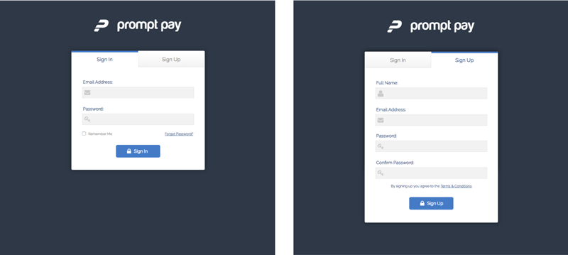
View the PrototypeThe sign in and sign up menu both share the same modal and the user can click the tab to get to each. The modal is centered in the screen, so it is able to be used for both the desktop and portrait tablet version.
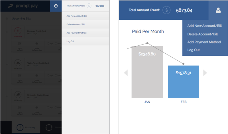
The navigation and menus are different for each the desktop and portrait tablet version. The desktop menu shows on mouse hover and the tablet menu shows on tap/click.
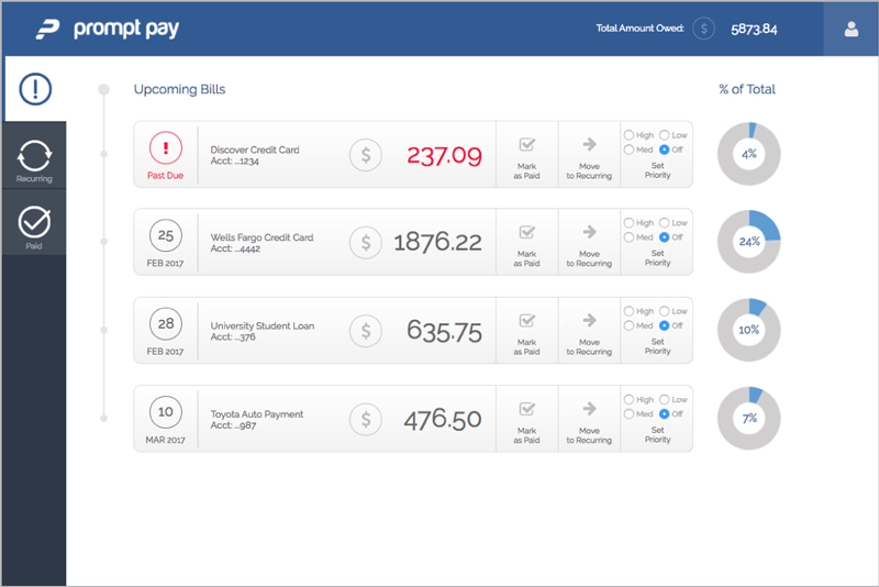
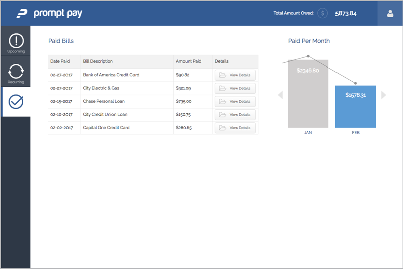
For the desktop version, the layout closely resembles a dashboard format with a left side navigation. I feel this layout makes the interface as simple and clean as possible while displaying a large amount of information.
• Displays description of bill, due date, and amount due
• Able to mark bills as paid, move bills to recurring to set up auto payments, and prioritize by color coding
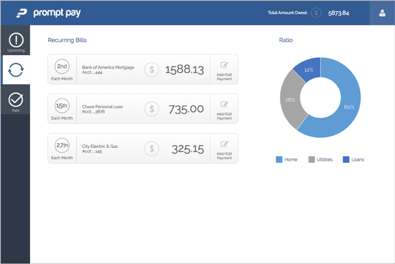
• Displays description of bill, what day of the month it is paid, and amount due
• Able to add/edit payment method
• Displays description of bill, date paid, and amount paid
• Able to view details
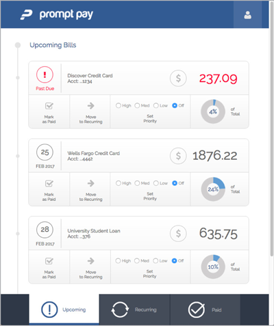
For the tablet version, the navigation moves from the left side to the bottom to be more easily accessible to users on touch screen devices. To save space, the total amount owed has been moved into the menu.
• Displays description of bill, due date, and amount due
• Able to mark bills as paid, move bills to recurring to set up auto payments, and prioritize by color coding
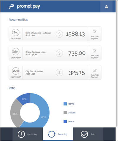
• Displays description of bill, what day of the month it is paid, and amount due
• Able to add/edit payment method
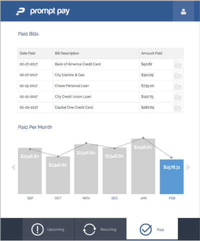
• Displays description of bill, date paid, and amount paid
• Able to view details
Categories
Submit a Comment