
What factors determine whether a graph is “good” or “bad”? Below I analyze two different graphs using concepts developed by Stephen Few and Stephen Kosslyn. Based on these concepts, I then recreate the “bad” graph version to better align with the story the graph is trying to tell.
.
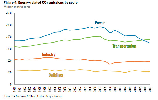
This graph was published with the Vox.com article Cars and Trucks are America’s Biggest Climate Problem for the 2nd Year in a Row by Umair Irfan. It highlights the fact that carbon dioxide (CO2) emissions from the transportation sector surpassed emissions from the power sector starting in 2016.
In the article, the author explains the distribution and change of energy-related CO2 emissions while comparing the difference between the sectors of power and transportation. These relationships correspond to Stephen Few’s classifications of distribution, time, and deviation. The classification of distribution is presented as the amount of emissions, expressed as a count on the y-axis, in million metric tons across consecutive intervals. The author used a line graph to represent these distributions. Due to multiple sectors present, this would be considered a multiple distribution. The classification of time is shown through the quantitative values of the emissions changing over time—years 1990 through 2017 displayed on the x-axis. The classification of deviation, although not explicitly shown in the graph, is discussed as the main subject the article as one value (emissions from transportation) in relation to another value (emissions from power). The author expressed the power sector as a value of reference in relation to the transportation sector.
The dependent variable within the graph is the emission quantity, which is an interval value. The independent variables are the length of time (years), which is an ordinal value, and type of sector, which is a nominal value.
This graph was a great choice to use for this article. It simply and quickly displays a comparison of trends of the amount emissions (in million metric tons) by sector (power, transportation, industry, building) over the course of time (years). The line graph also provides the reader with the exact moment when one sector bypassed another. This was the most impactful method of showing this information.
The article’s intended audience includes readers interested in recent climate and environmental news. Lately, there has been much discussion about effects on climate and how the United States is progressing, especially compared with the rest of the world. The power sector, which includes coal and natural gas, is generally the most publicized of all sectors in relation to greenhouse gas emissions. Therefore, the fact that the transportation sector has surpassed the power sector may be surprising news to the intended audience.
This graph is effective in carrying out Stephen Kosslyn’s first goal of connecting with the audience because it is relevant and provides neither too much nor not enough information. It is also appropriate knowledge for the readers of this article.
The author of this graph was effective in directing and holding the reader’s attention through use of the principles of salience, discriminability, and perceptual organization. The prominence, or salience, of the graph allows it to be noticeable among the text of the article, and even alongside the advertisements on the page. The bright and bold color selection helps to immediately identify the different sectors.
The principle of discriminability was also adhered to in this graph. The text used for the headline, x-axis, y-axis, and labels are clear and distinct. The labels are especially helpful in identifying each line due to their close proximity, use of a bold font, and similarity of color. The ability to determine the amount of emissions produced by sector over time would be easily discernible by the reader.
The principle of perceptual organization is also present and effective in this graph. The aspect of input channels can be seen though the boldness, color similarity, and proximity of the labels of the different sectors. This helps the reader unconsciously organize the labels into groupings with their according lines. The aspect of three-dimensional interpretation is present with the use of bright, warm colors for the sector lines versus the simple black lines along the x-axis and y-axis. This results in an almost 3D-effect where the long-wavelength, warmer colors seem “closer” to the reader. The aspect of integrated versus separated dimensions is seen in this graph only through the use of integrated dimensions. Since the same type of information is used, the author has used the same thickness and type of line for each sector, while using only color as visual separation. Finally, the aspect of grouping laws is present in this graph, yet is also helped though the data. The lines are all leading in the same direction and stay mostly parallel to each other until the transportation sector line crosses the power sector line. This one area, which also happens to be the main subject of the article, is automatically more visually prominent due to the difference from the rest of the graph. This graph did not contain any erroneous elements that could be considered “chart junk”.
This graph is easily able to be understood at a glance and later recalled without effort, therefore promoting and understanding memory. The use of a line graph for this data was the best choice to promote memory. According to the principle of compatibility, data points embedded in a continuous line are best suited for integrated information.
The principle of informative changes states that changes in properties should carry information. Therefore, a change that could be made to this graph would be the addition of a visual indicator or label where the transportation and power lines cross.
The author was effective in conveying the principle of capacity limitations. Only four perceptual groups were present at once, therefore staying within the reader’s short-term memory limits. Visual searching is also limited, so the ability to read this graph would fit well within the reader’s processing limits. Labels throughout this graph support this principle, however a small change that could be made would be to move the “million metric tons” label for the y-axis to the left side of the graph where readers are used to seeing it instead of right below the headline.
.
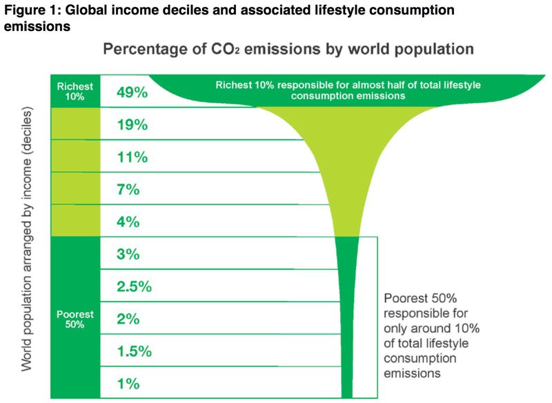
This graph was published with the Vox.com article Wealthier People Produce More Carbon Pollution—Even the “Green” Ones by David Roberts. It highlights the fact that wealthier people emit more carbon, even when attempting to actively reduce their carbon footprint.
In the article, the author explains the distribution of a simple relationship of proportions of CO2 emissions by world population based on income percentage (deciles). These relationships correspond to Few’s classifications of distribution, nominal comparison, and part-to-whole. The classification of distribution is presented as the amount of emissions, expressed as a count on the x-axis, in comparison to consecutive intervals of percentage of income deciles on the y-axis. The author used a funnel shape to represent these distributions of each income group. Since the graph is measuring one factor, this would be considered a single distribution. The classification of nominal comparison is shown through the display of discrete values to highlight their relative sizes. The classification of part-to-whole is present in the proportions of the graph—percentages that each income decile contributes to the total emission amount.
The dependent variable within the graph is the percentage of emissions produced, which is a ratio value. The independent variable is the world population arranged by income decile, which could be a ratio value if percentage is used or an ordinal value if the ranking of decile is used.
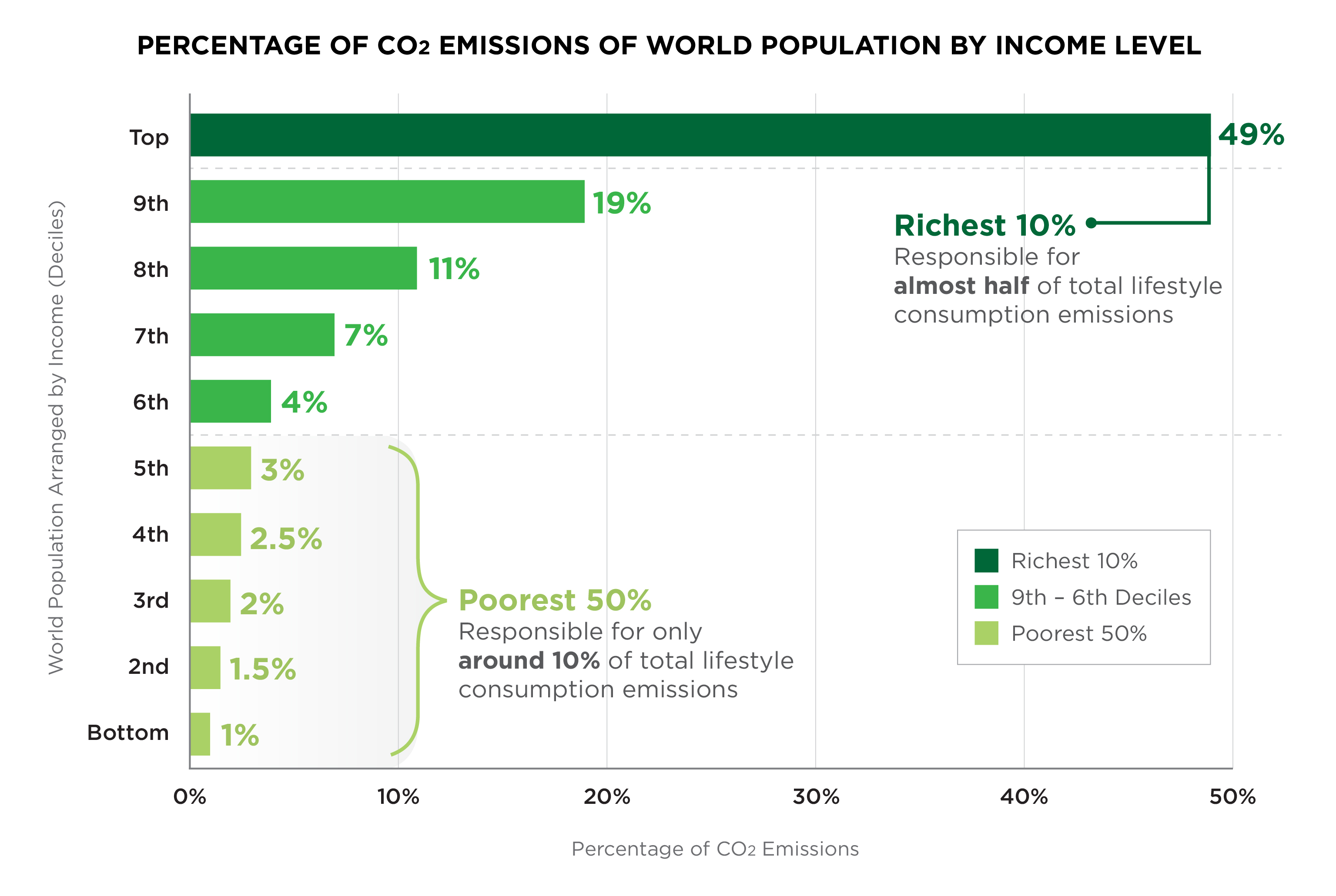
The choice of a funnel shape was not the best solution for this article. It is very difficult at first glance to visually assess the distribution of emissions produced by each of the 10 income deciles. In maintaining the identifying shape, the reader is unable to see an exact part-to-whole comparison, nor the relative sizes. Although a pie chart could be used for this type of data, a bar graph would be the best solution to show the distribution.
The article’s intended audience includes readers interested in recent climate and environmental issues. Many people are concerned with how to live a more environmentally friendly lifestyle, and as such, attempt to make lifestyle decisions to reduce the emissions they contribute. However, for the most part, a person’s wealth is what determines their ecological footprint by a huge percentage.
This graph is effective in carrying out Kosslyn’s first goal of connecting with the audience because it is relevant and provides neither too much nor not enough information. It is also appropriate knowledge for the readers of this article.
The author of this graph was only somewhat effective in directing and holding the reader’s attention through use of the principles of salience, discriminability, and perceptual organization. The salience of the graph allows it to be noticeable among the text of the article. The bright and bold color selection helps the audience immediately identify the income deciles the author is highlighting.
The principle of discriminability can be found though clear and readable text used for the headline, y-axis, and labels, however the x-axis being unlabeled and unused causes confusion. Consecutive intervals cannot be determined visually by the reader.
The principle of perceptual organization is not effective in this graph. Although the aspect of input channels can be seen though the boldness or color and proximity of descriptive labels, it is difficult to organize how the percentages relate to the income levels and the funnel visual. The aspect of three-dimensional interpretation is overused with the use of bright, warm colors for not only the funnel, but also the graph lines which should visually fade to the back. The aspect of integrated versus separated dimensions is highly confusing within this graph. The same type of information is present, however the shape of the funnel creates separable dimensions, which should only convey different measurements. The aspect of grouping laws is present in this graph. The author highlights that the richest 10% are responsible for the large section at the top, while the poorest 50% are responsible for the very thin section at the bottom. Grouping with labels are used to define these sections. This graph contained the funnel shape which would be considered “chart junk”.
This graph may be difficult to be understood at a glance and recalled without effort. The use of the funnel for this data was not the best choice to promote memory. Although the form of the funnel is somewhat compatible with the graph’s meaning, perceptual distortion and spatial imprecision are both present, therefore it doesn’t adhere to the principle of compatibility.
The principle of informative changes is present in this graph. There are labels in or near the two areas that had significant changes the author wanted to highlight.
This graph was not effective in conveying the principle of capacity limitations. Although there seems to be three perceptual groups displayed in the graph horizontally, there are also three to four perceptual groups displayed vertically. Since the graph is very segmented, and visual searching is complex, it would be difficult on the reader’s short-term memory and processing limits. The author did explain encodings and labeled the graph, however the information would be much better explained using a bar graph.
Categories


Submit a Comment