The Humane Society of the United States (HSUS) is a non-profit organization which aims to address animal-related cruelties at a national scope. The organization’s guiding principle is to “oppose and seek to prevent all use or exploitation of animals that causes pain, suffering, or fear.” The goal of this project was to improve the current structure of the Humane Society’s website by implementing a completely revised information architecture. Disclaimer: I am not affiliated with The Humane Society in any capacity. Information Architect & UX Designer Mar – May 2018 • Individual Project
Overview
Role & Duration
Areas of Focus: Information Architecture, Interaction Design, User Research
Currently (as of March 2018), much of the information on the HSUS website is disorganized and difficult to find. The current architecture impedes the finding of needed information, and is further complicated by the large amount of items contained within the site.
This disorganization leads to confusion and frustration for the user. For HSUS—a non-profit organization supported by donations—it makes this issue even more imperative to resolve quickly.
To gain more understanding of the users and product scope, I started research by conducting an initial assessment of the information structure of the HSUS website and a heuristic evaluation of the usability of the interface design. Next, based on knowledge gained, I completed a content inventory.
The scope of the content inventory included all of the first and second level pages of the current website. Items within all navigation menus were included to get an idea of the overall depth, breadth, and range of the information.
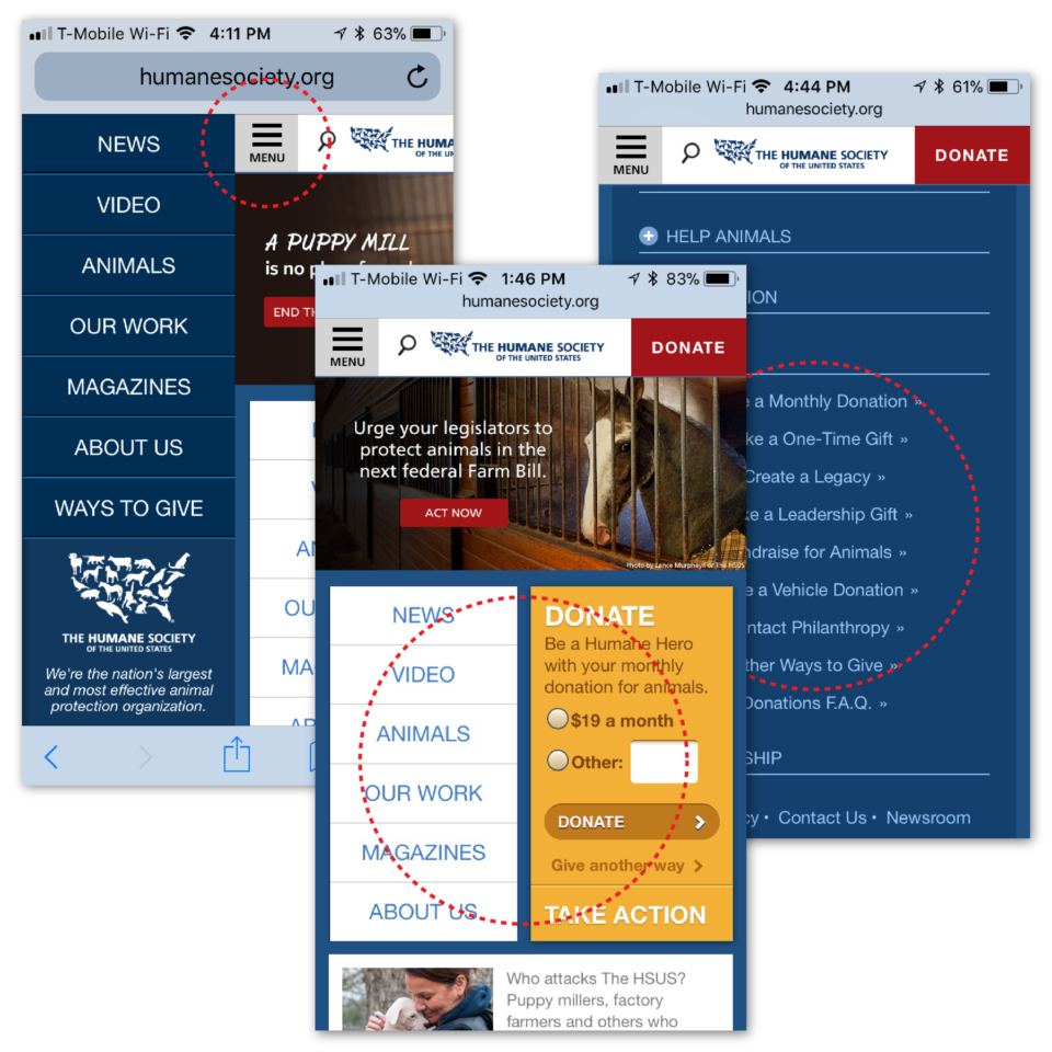
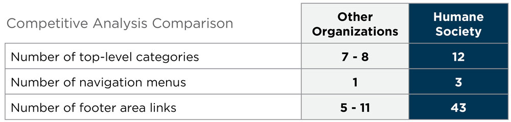
The HSUS mobile application has a total of three different menus on most pages, in addition to a footer that also acts like another menu.
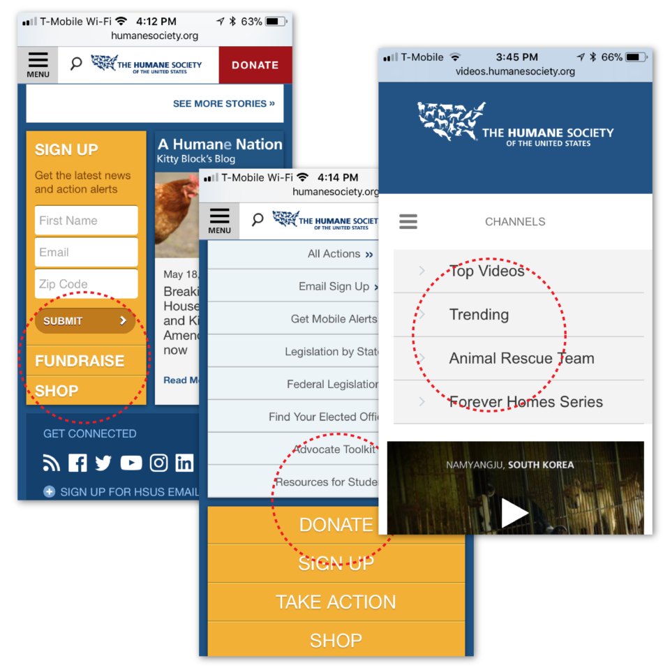
Content, style, and arrangement of categories and items changed from page to page, and at times elements were completely missing.
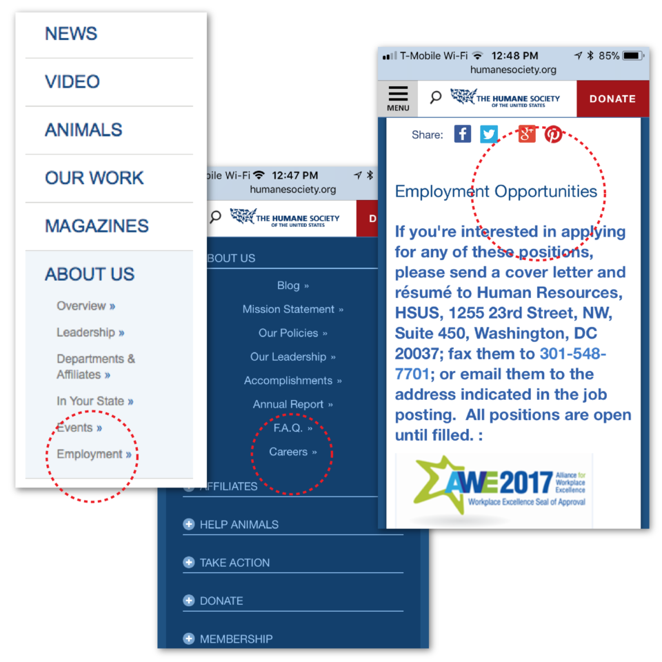
Some links are named differently yet go to the same destination; there are also labeling differences between desktop and mobile versions of the site.
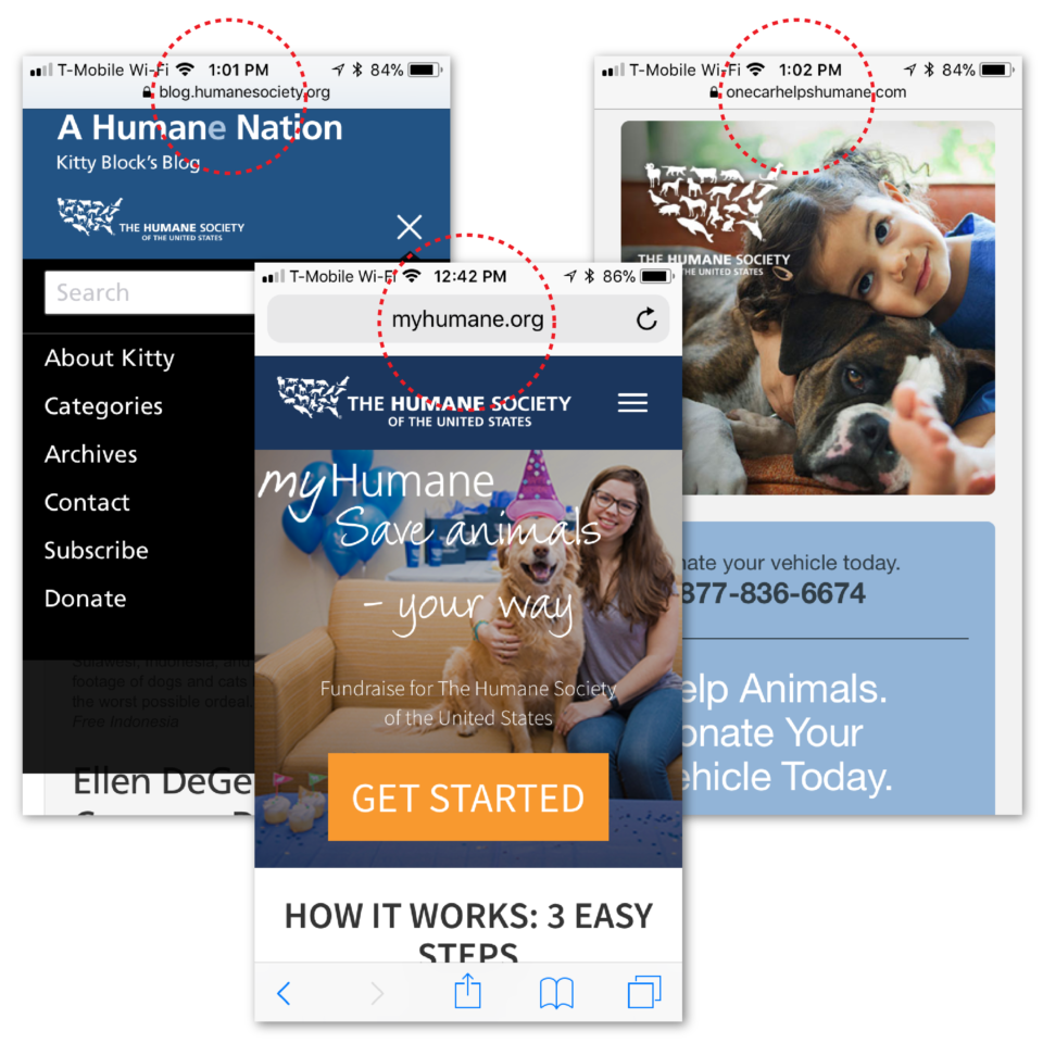
Some links go to different websites with completely different URLs; these websites all have different designs, layout, and menu structure.
After reviewing the compiled content inventory, this website was determined to have an ambiguous organizational scheme and a topical organizational structure. Content items were refined and reworded to adhere to this scheme and structure, and repeated items were combined. A consistent navigation labeling system was developed containing all second-level page categories for use in the upcoming card sorts.
After completing a content inventory of the HSUS website, other websites belonging to similar animal-related non-profit organizations were analyzed. These organizations included the ASPCA, SPCA International, and Best Friends Animal Society. Information was collected on their primary navigation, including the names of the top-level categories and the type of content that was held within each.
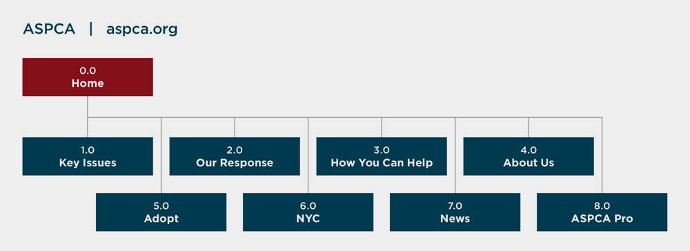
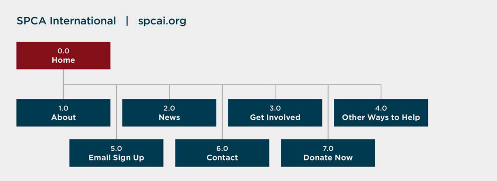
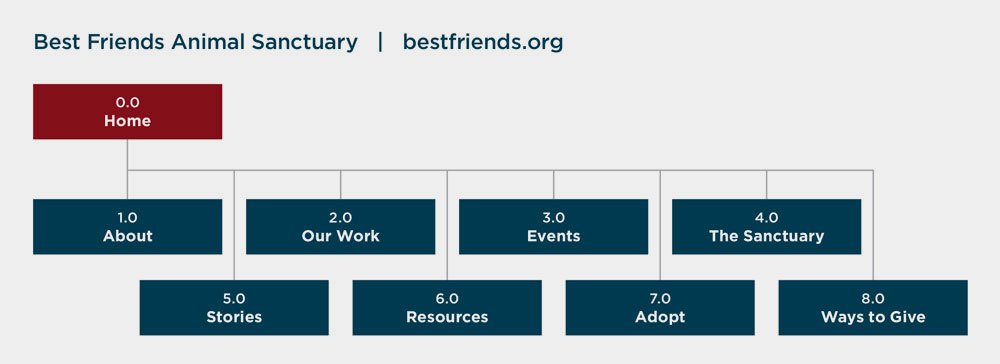
This information was used to help assess how the current content inventory of the HSUS was structured and how items could be classified differently to potentially help users.
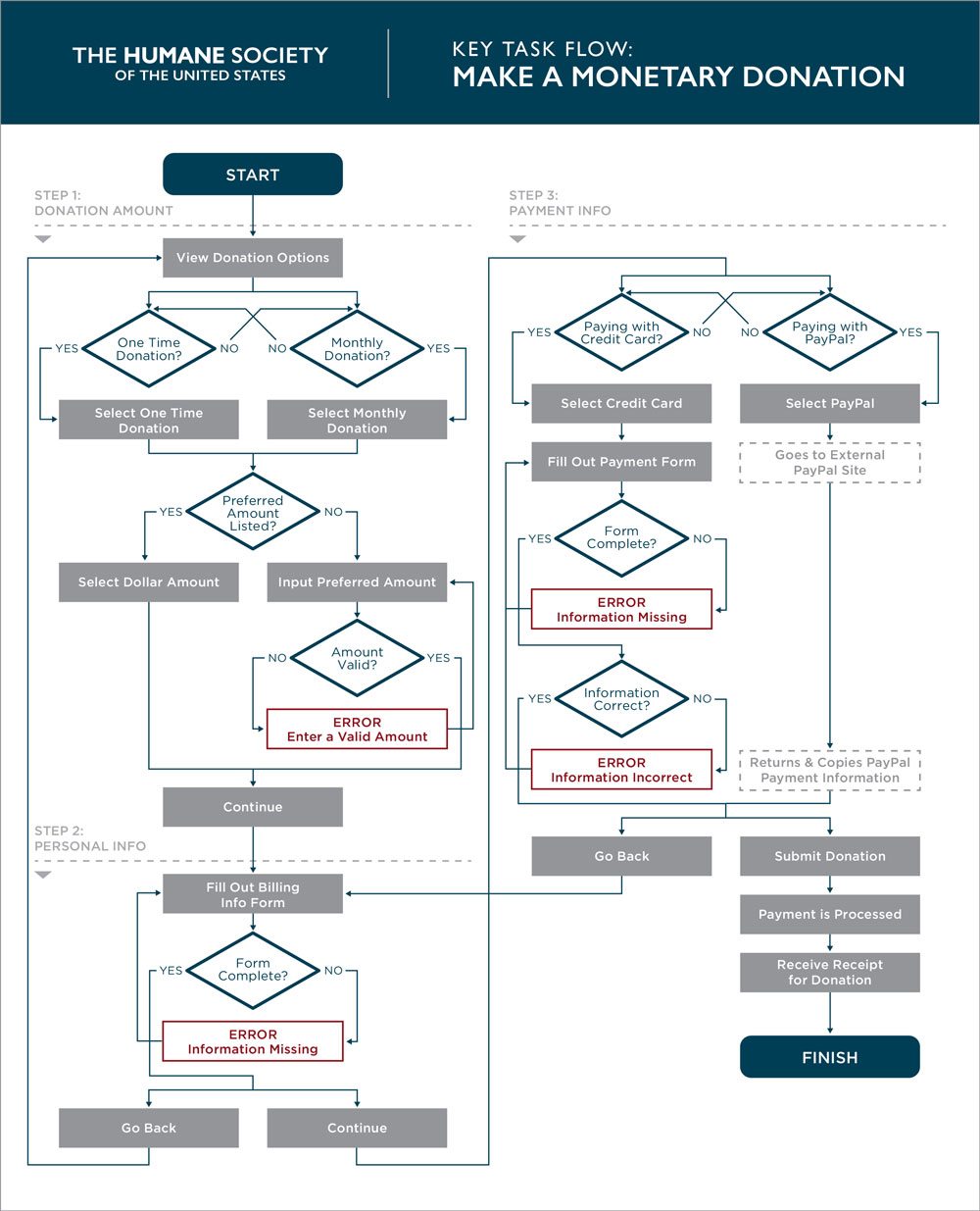
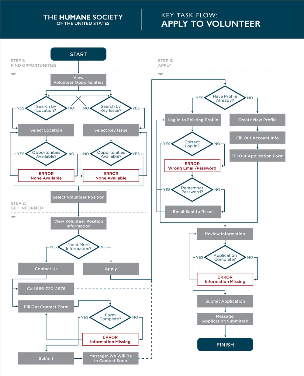
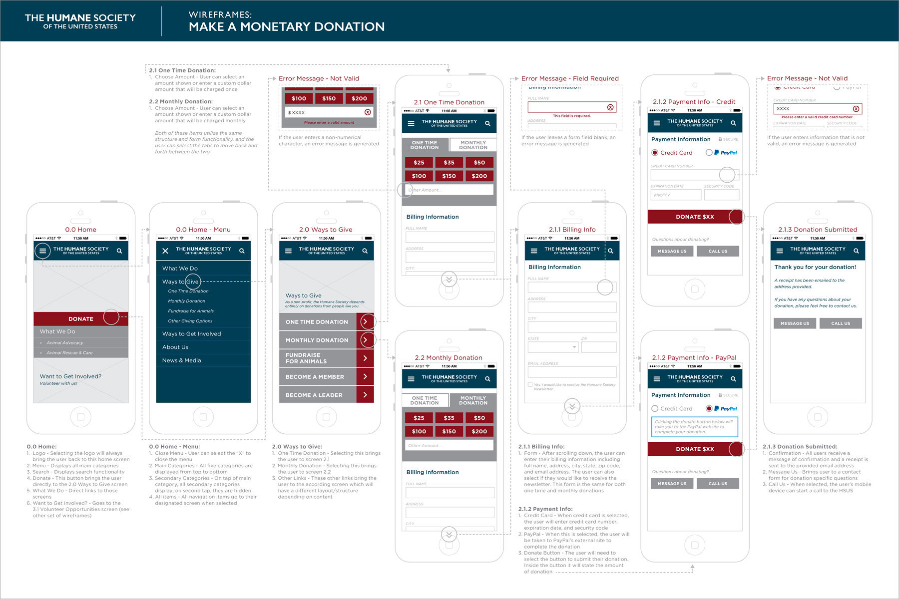
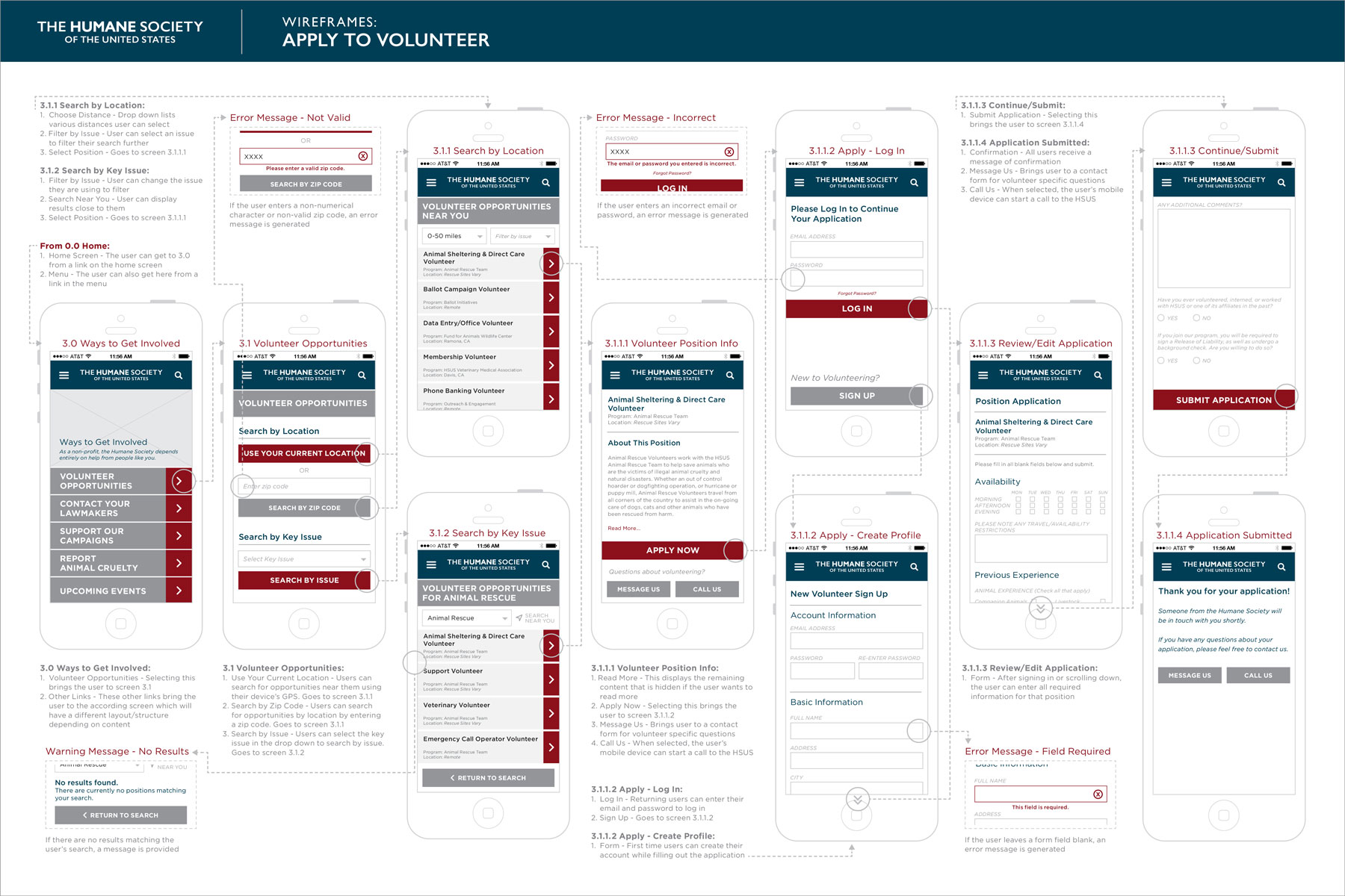
Key task flows were created for the processes of making a monetary donation for “The Donator” persona, and applying to volunteer for “The Activist” persona.
These both were chosen because they tend to be the most important needs for non-profit organizations. The more money and time received from donors and volunteers means the more immediate and direct impact to benefit the lives of animals.
An open card sort was conducted first with four participants to gain an initial understanding of the labels and structure. OptimalSort was used and all completed the sort online. The participants sorted the 32 items into an average of seven categories. Findings included:
• “About Us” was a consistent category name added by participants.
• “Direct Support,” “Donate,” and “Ways to Give” were also added category names that included items about donation.
• “Get Involved,” Take Action,” and “Direct Support” included items about active help.
• “Advocacy,” “What We Do,” and “How We Help” included items about what the HSUS does.
Using the information from the content inventory, competitive analysis, and open card sort, five categories were created and then used for a closed card sort:
The closed card sort was conducted with a total of 57 participants. OptimalSort was used again, and all participants completed the sort online. There were 32 total items to sort.
The average time taken by participants to sort all items was 3.88 minutes. Participants were quickly and easily able to place items in each category.
The popular placements matrix below shows the percentage rate of each item placed into each category. Many items had a high level of agreement.
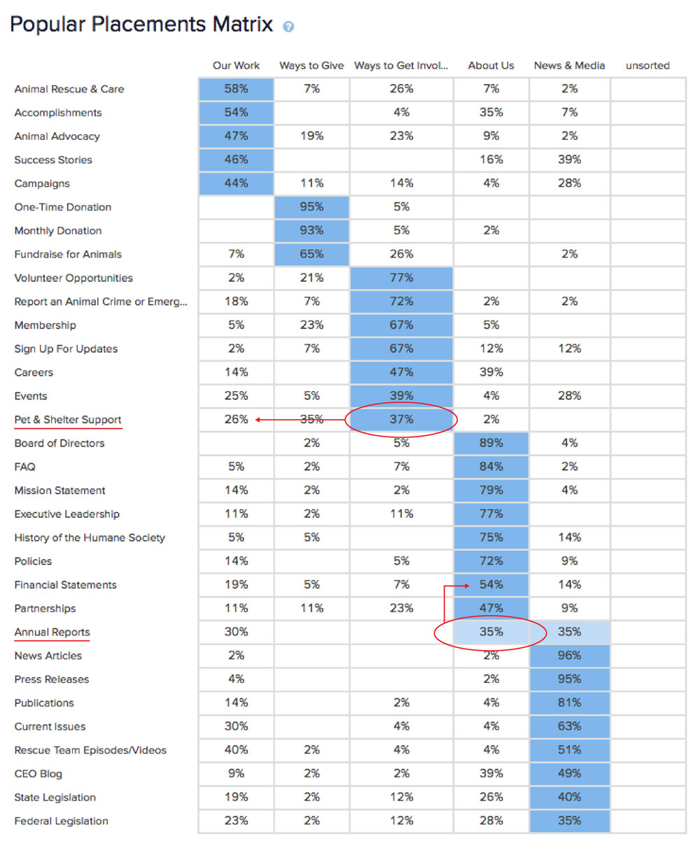
The overall structure of the results was maintained for the first version of the sitemap and task-based testing except where noted above in red.
• “Pet & Shelter Support” was changed to “Animal & Shelter Support” with the hope this would better align.
• “Annual Reports” was equally selected to be in both “About Us” and “News & Media,” so the choice was made to keep it with “Financial Statements” since the two items are similar.
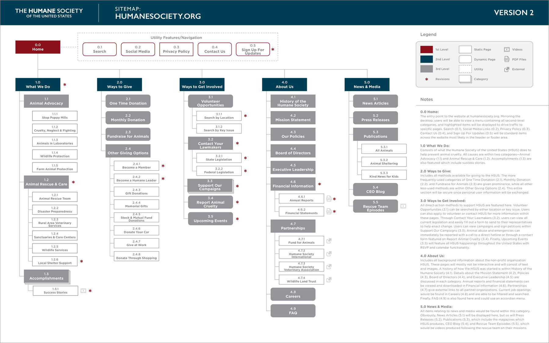
An initial sitemap was created based on research collected so far.
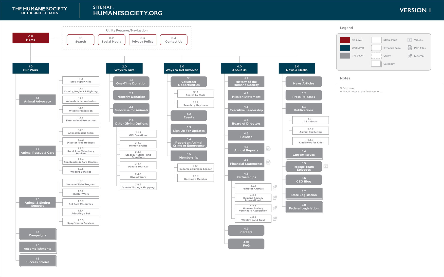
Two phases of task-based testing were then completed. The first phase used the sitemap above, and the second phase used a new iteration of the sitemap based on results from the first phase.
Task-based testing was completed using Treejack. A total of 41 participants completed the study. The average time taken was 2.40 minutes. Participants were asked to complete five tasks—one for each primary navigation item.
Below are the results of this first task-based test. A percentage rate over 80% would be considered successful for this study.
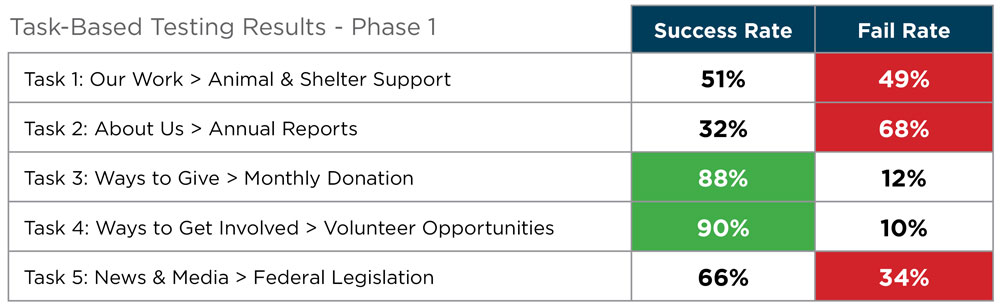
For task one, most participants (73%) did visit “Our Work” first, however for 22% of participants, “About Us” was their first visit, and from there five participants chose “Mission Statement.”
Next Iteration Adjustments:
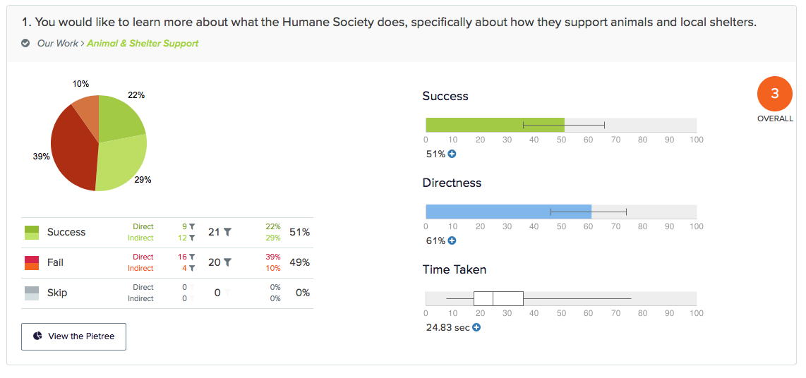
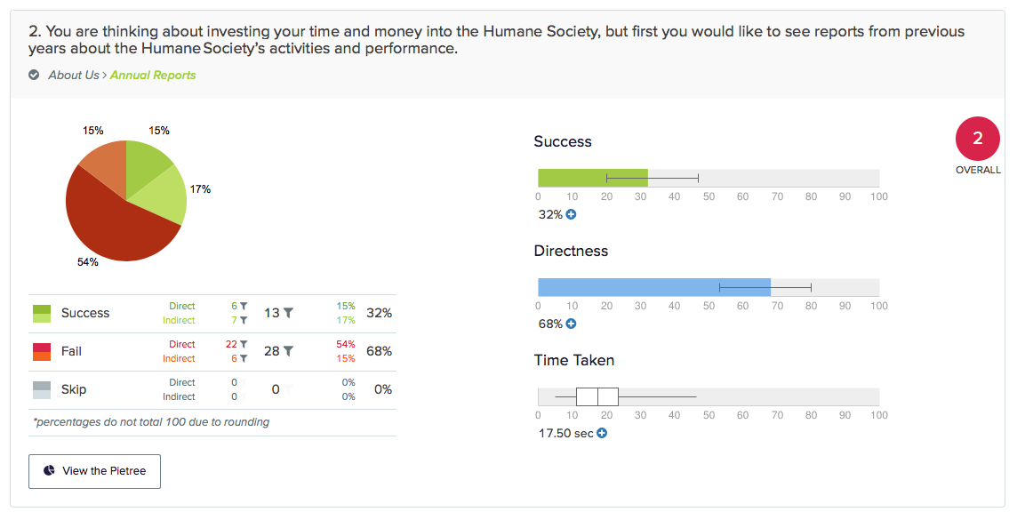
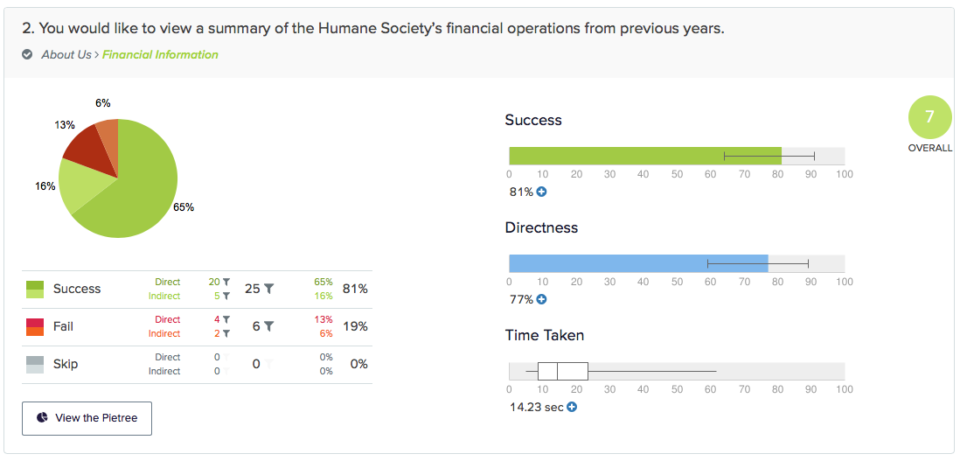
For task two, the wording of the task instructions could have contributed to confusion and failure. Differences of opinion of where “Annual Reports” should be located, as seen in the previous card sort, could also be causing confusion since 37% of participants visited “News & Media” during the task and 39% visited “Our Work” during the task.
Next Iteration Adjustments:
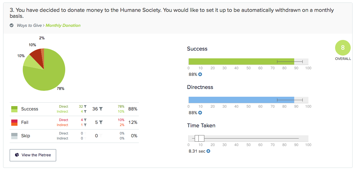
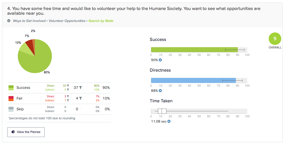
Task three would be considered successful with an 88% success rate, but some participants did visit “Ways to Get Involved” and “Membership” instead.
Next Iteration Adjustments:
Task four would be considered successful at 90%.
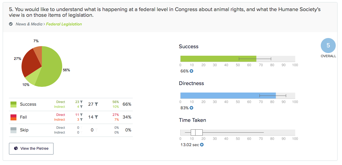
The failure rate of task five seems to also be caused by the wording of the task and differences of opinion of where “Federal Legislation” (and “State Legislation”) should be located. Although most participants (63%) visited “News & Media” first, 20% of participants did visit “About Us” first.
Next Iteration Adjustments:
.
A second round of task-based testing was completed with the changes mentioned above in task details. A total of 31 participants completed the study. The average time taken was 1:20 minutes. Participants were asked to complete three tasks—one for each previously failed task.
All three tasks were re-written to be more succinct and clear, and some of the categories and labels were changed. Below are the results of the second task-based test. Again, a percentage rate over 80% would be considered successful for this study.
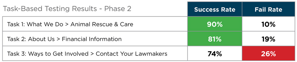
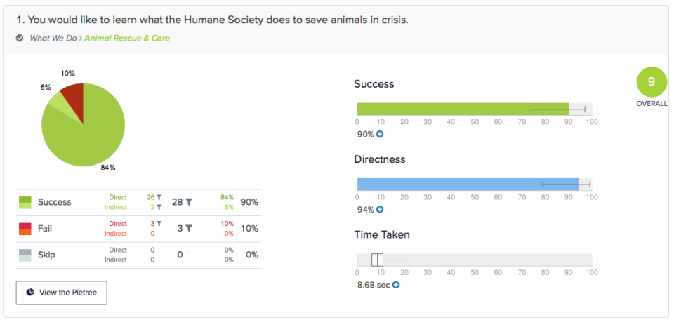
Task one would be considered successful with a 90% success rate. Overall, revisions to the task instructions and sitemap led to a significant improvement.
Task two would be considered successful with an 81% success rate. Revisions to the task instructions and sitemap led to a significant improvement from the 32% success rate of round one for this task.
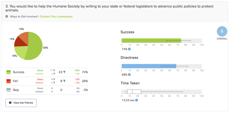
Task three, although improved, would not be considered a success with a 26% fail rate. Most participants visited “Ways to Get Involved” first, but from there some participants selected “Support Our Campaigns” or “Volunteer Opportunities.” There could be some possible overlap of information within these sections.
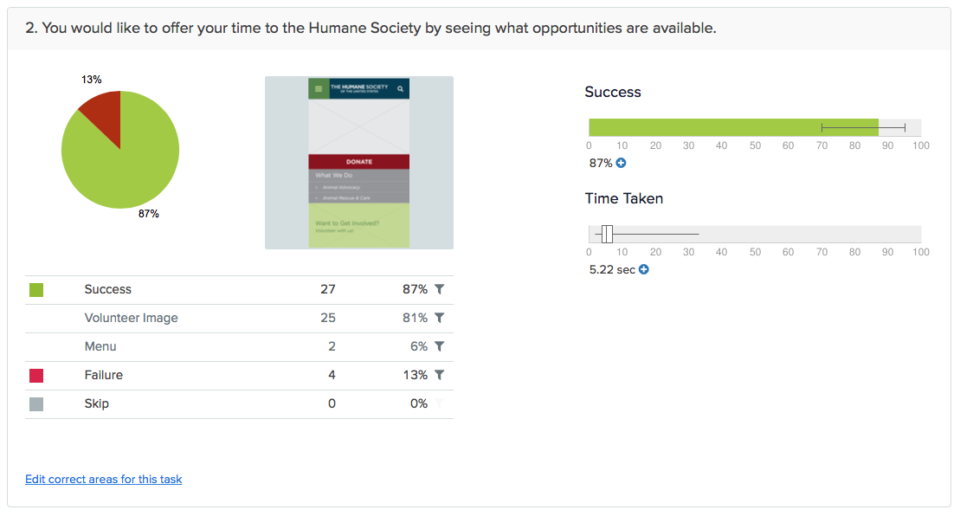
During the second round of task-based testing, first-click testing was also completed with the same participants. A total of 31 participants completed the study and the average time taken was 0:72 minutes.
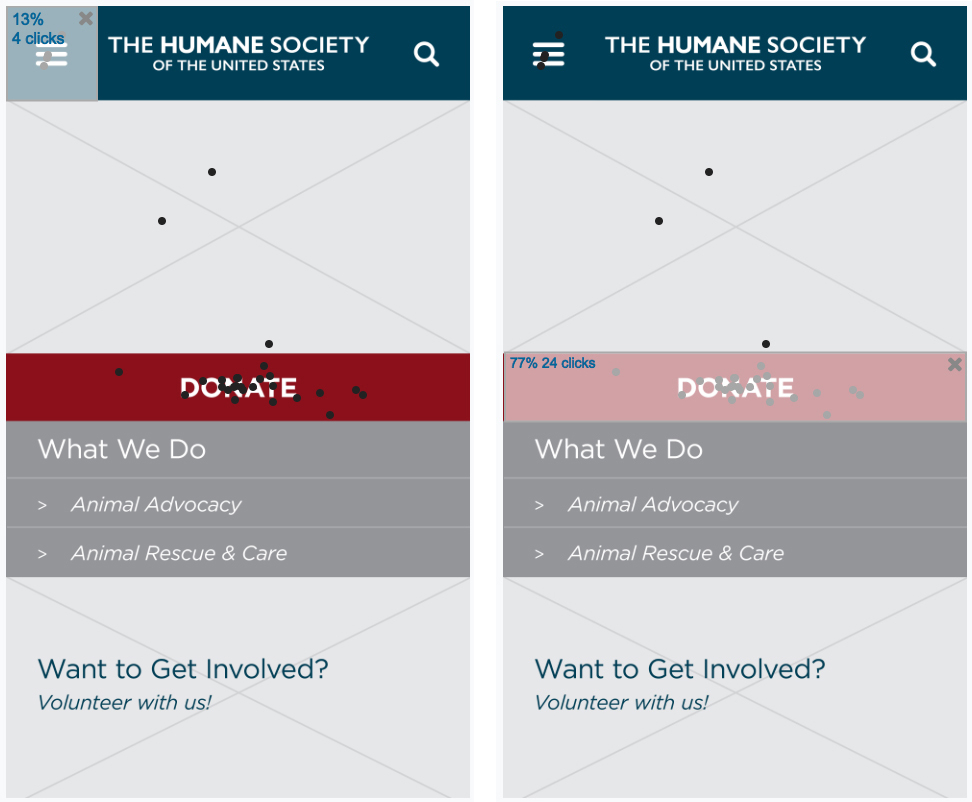
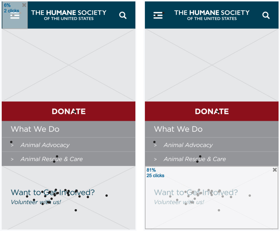
Participants were asked to complete two tasks, and the same wireframe image of the mobile home screen was used for both tests. Both of these tasks tested the success and time it took for participants to decide where they would find the needed information and click on the screen.
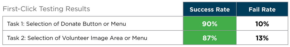
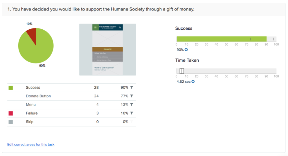
Task one was successful with a 90% success rate. 77% of participants selected the donate button and 13% selected the menu. The average time taken was 4.62 seconds.
Task two was also successful with an 87% success rate. 81% of participants selected the volunteer image and 6% selected the menu. The average time taken was 5.22 seconds.
After analyzing results from the task-based testing above, a final sitemap was created.
Wireframes were created for the same processes as the key task flows—making a monetary donation and applying to volunteer. The home screen wireframe was used in first-click testing for both of these tasks to understand how easily users can initially navigate to and locate these categories. These also followed the structure of the final iteration of the sitemap.
For this project, the goal was to understand the current information available on humanesociety.org and to analyze if there was a better way in which the information architecture can be structured. A testing strategy was defined and implemented.
The findings during this process support the need for a revised information architecture, while also confirming the success of the revised deliverables. A content inventory of the website revealed current issues, such as multiple repeating navigation menus, and inconsistencies in navigation, labeling, and URLs. An open card sort and competitive analysis both returned different category names from those currently in use, while the closed card sort returned different item groupings under each category.
After two rounds of task-based tests, results show that users were mostly successful in locating items within each category of the revised structure. Finally, first-click testing results showed that users were successful navigating from the home screen to the two sections the HSUS would most likely want to drive users to—making a monetary donation and applying to volunteer.
.
.
Email me or fill out the contact form linked below.
Contact Me