Communicating information through visualizations plays a large role within UX design. It is important to be able to choose effective means to visualize data for both an intended audience, and for the message you intend to communicate. Three data visualizations using three different datasets were created and are detailed below. The goal of these projects was to use various applications to first analyze quantitative data, and then create infographics that are not only visually pleasing, but also quickly and easily understood. UX Designer & UI Designer Jan – Mar 2018 • Individual Project
Overview
Role & Duration
Areas of Focus: Visual Design, Data Visualization
Applications Used: R Studio, Adobe Illustrator
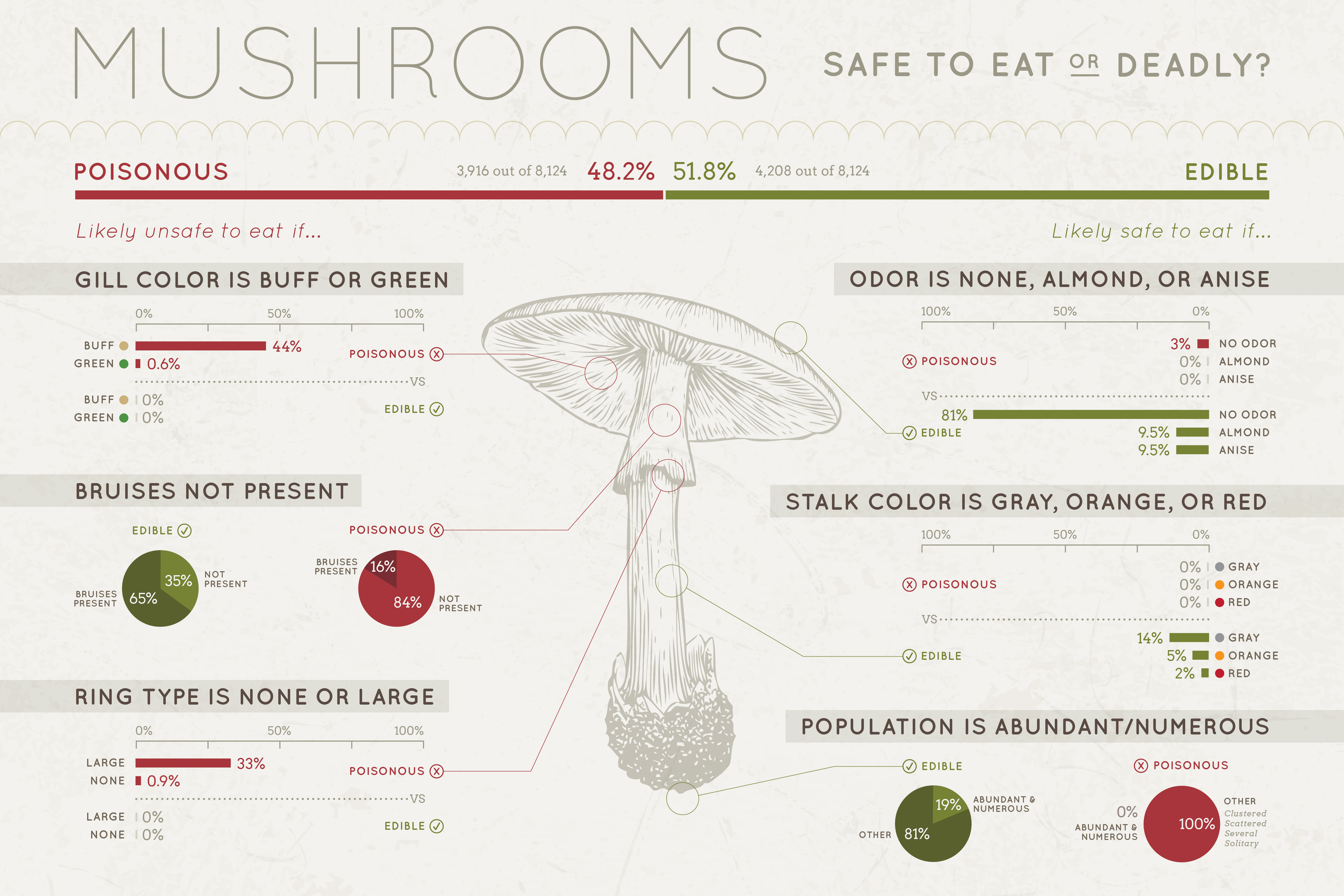
Features of each poisonous and edible mushroom were analyzed using the amount percentage.
Since eating the wrong mushroom could actually cause death, I highlighted the features that had the largest difference between the percentages of poisonous and edible, while also focusing on the features that were found zero percent of the time. Since there was data for over 8,000 different mushrooms, I feel that a zero occurrence of a feature would mean the lowest possible chance of poisoning.
Applications Used: Excel, R Studio, Adobe Illustrator
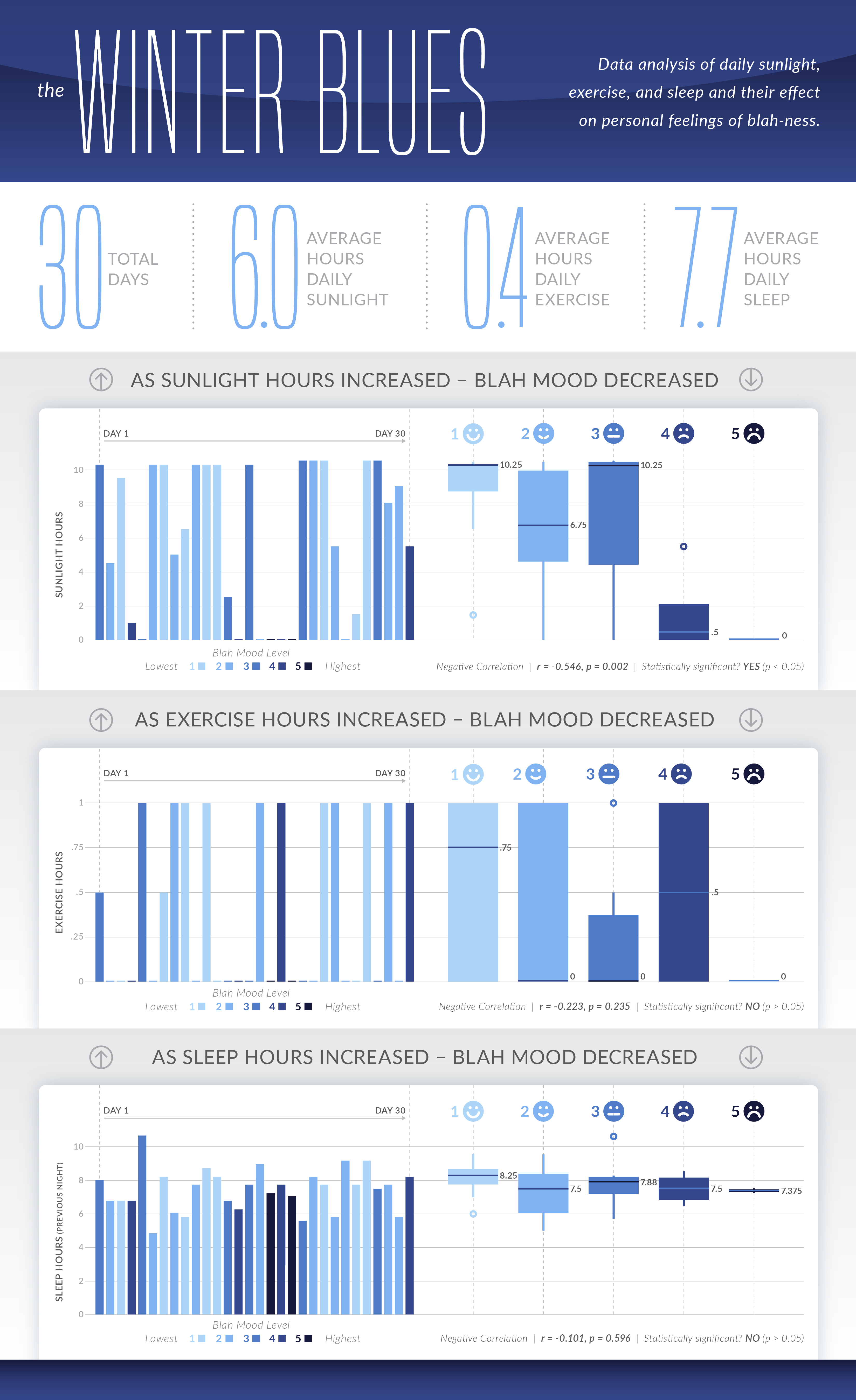
I analyzed daily sunlight, exercise and sleep over 30 days during the winter, and then rated my overall “blah” mood on a 1 to 5 scale, with 5 being the highest level.
The reason I decided to analyze this type of data is because every winter, especially on the more grey days, I notice lack of sun sometimes has an effect on my mood. In addition to amount of sunlight per day, I also wanted to see if amount of exercise and sleep had any effect since I’ve heard those could help improve your overall mood. Sunlight hours was the only factor that led to statistically significant results.
Applications Used: R Studio, Adobe Illustrator, D3.js, HTML/CSS, Bootstrap Framework
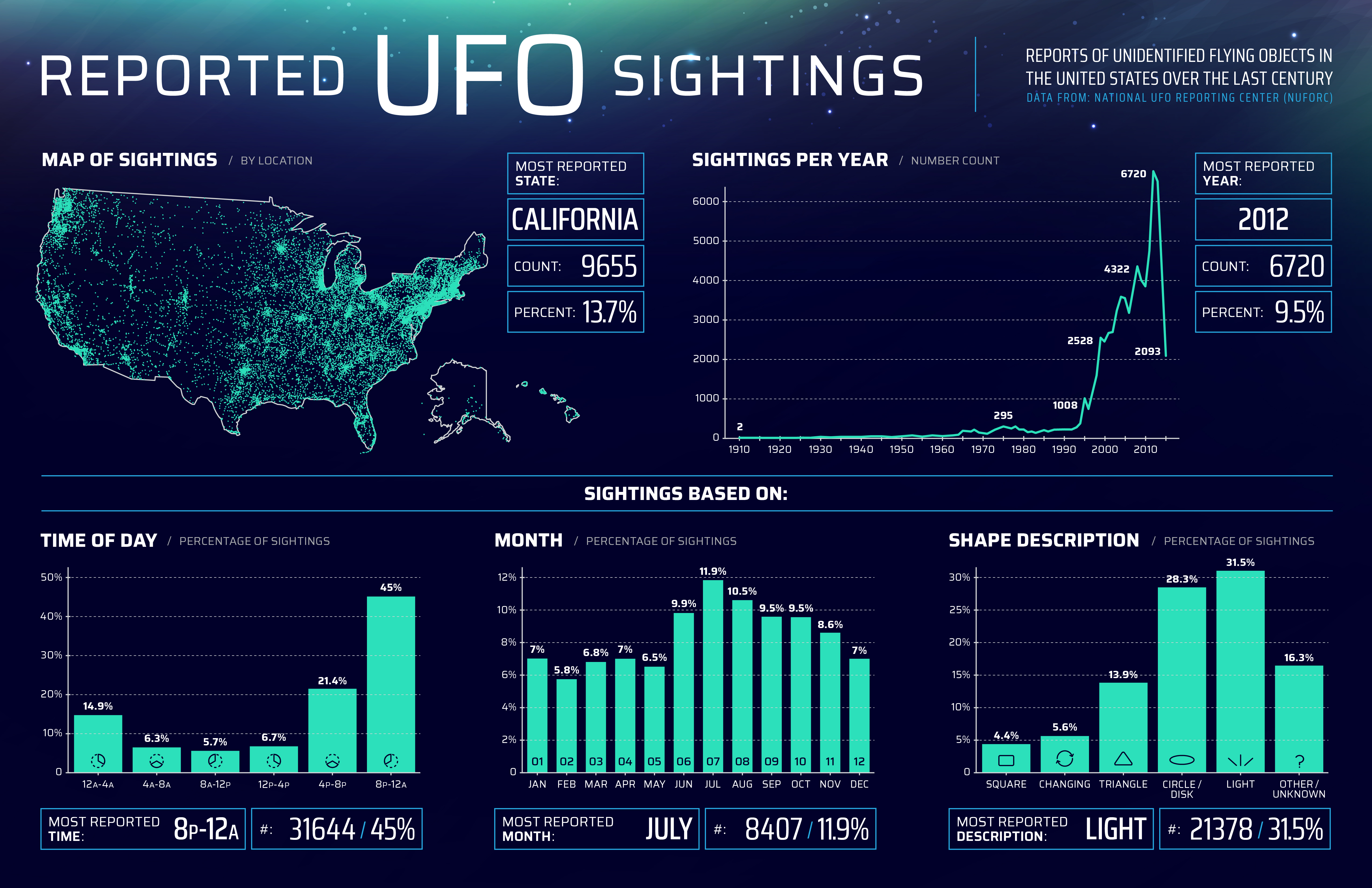
This infographic was created using the UFO Sightings Dataset from the National UFO Reporting Center (NUFORC). The dataset included over 80,000 reports of UFO sightings over the last century. Only data for the United States was used.
Using this infographic, the following five research questions were answered: (1) What U.S. state has the most UFO sightings? (2) Has there been a change in UFO sightings over the last century? (3) Is there a common time of day for UFO sightings? (4) Is there a common time of year for UFO sightings? (5) What is the most common UFO description reported?
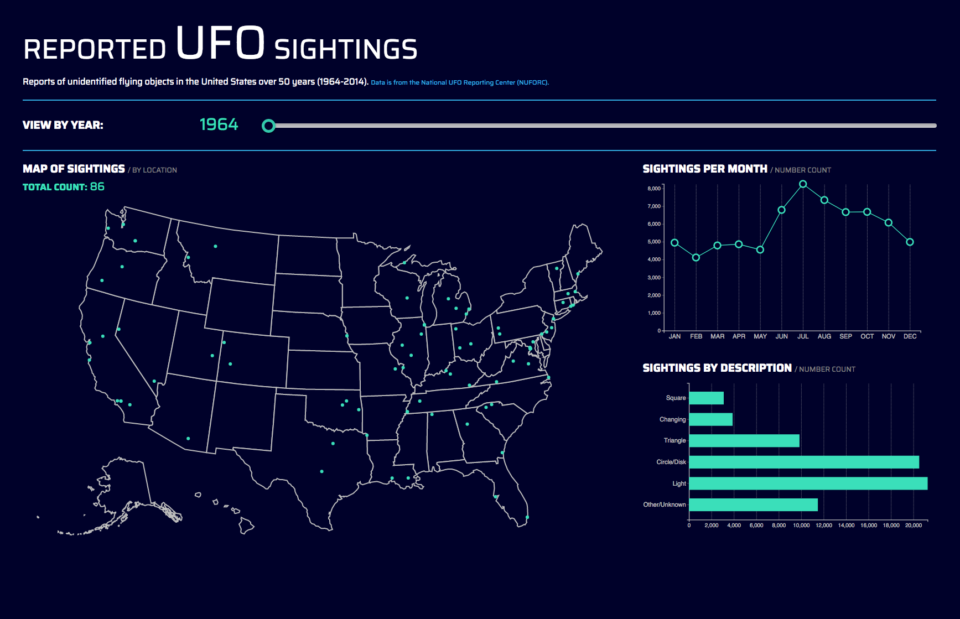
Using the same dataset, but scaled back to only the years between 1964-2014, an interactive visualization was also created. It is still a work in progress, but please click below to view the live site.
UFO Sightings Interactive Visual
.
.
Email me or fill out the contact form linked below.
Contact Me