About the Project
Sephora and Ulta Beauty are both retail giants and direct competitors in the global cosmetics market which is worth an estimated $48.3 billion (CNBC.com, 2018). Although these companies started off very differently, the strategies of these two retailers are converging as consumer demand for makeup products and services increases. Revenues at Sephora have doubled since 2011, while Ulta has been opening approximately 100 new locations annually within the past few years alone (FinancialPost.com, 2017). With each competing to capture a larger share of this market and striving to come out ahead of their competitor, website usability is now more crucial than ever to increase and retain customer base.
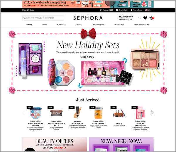
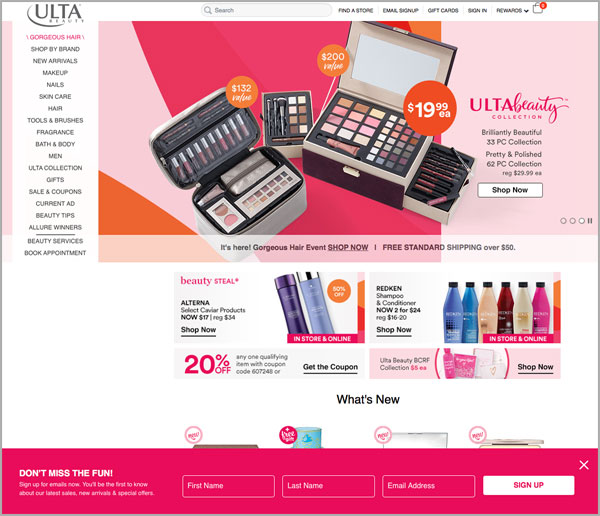
Through summative usability testing and A/B testing, our aim was to investigate if the Sephora homepage helps users find information on products and services more efficiently than the Ulta Beauty homepage.
Client
Personal Work
Created at
DePaul University
Project Team
Danielle Briseno
Stephanie Graf
Iu-Luen Jeng
Angela Wu
.
A/B Study Design
HYPOTHESIS
H0: The Sephora homepage and Ulta Beauty homepage are equally efficient when helping users find information.
DETAILS
The website homepages for two retail cosmetics competitors were tested: (A) Sephora: https://www.sephora.com versus (B) Ulta Beauty: https://www.ulta.com.


This study used a within-subjects design. The stimuli for Sephora and Ulta Beauty are different, so the carryover effect would be limited. Using within-subjects design also would help reduce errors associated with individual differences.
Participants completed ten tasks for the Sephora homepage and the same ten tasks for the Ulta Beauty homepage. Five of these tasks are related to cosmetic products and five are related to cosmetic services. All 20 tasks (2 stimuli x 10 tasks each) were randomized for participants to prevent learning and fatigue effects.
A medium effect size had been determined for this test due to the estimated difference of success rate between the stimuli. An alpha level of .05 had been set along with a 95% confidence level.
.
.
Methodology
PARTICIPANTS
46 volunteers (24 females and 22 males) participated in the study. An additional 17 applicants were rejected by the screening questions and did not participate in the study. Participants’ average age was 24.8 years (SD = 6.6). All of the participants had either zero exposure to both sephora.com or ulta.com, or have not visited the websites in at least 5 years. 33 participants were infrequent buyers, meaning they had purchased beauty products 0-6 times in the past year. 13 participants were frequent buyers, meaning they had purchased beauty products 7 or more times in the past year. 40 participants had heard of the brand Sephora before this study, while 6 participants had not. 36 participants had heard of the brand Ulta Beauty before this study, while 10 participants had not.
TESTING PROCEDURE
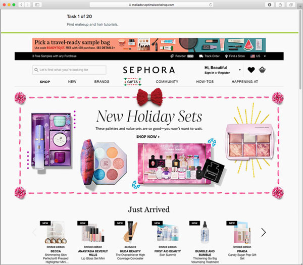
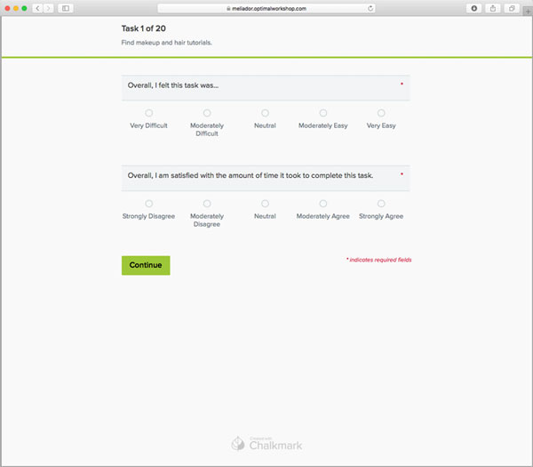
Participants were asked to complete an online testing session using the application Chalkmark by Optimal Workshop. Each session consisted of the following parts: (1) Introduction; (2) Screener; (3) Warm-Up Questionnaire; (4) 20 Search Tasks (2 stimuli x 10 tasks each); (5) Ease of Use and Efficiency Likert Ratings (which followed each task); and (6) Wrap-Up Questionnaire.
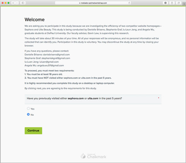
Upon clicking on a link for this study, participants were greeted with a screen explaining the purpose of the study and were informed they can stop at any time by closing their browser window. Participants were then asked questions to determine their eligibility. Participants not matching these criteria were stopped from continuing, while eligible participants were asked questions about their age, gender, and product-buying frequency.
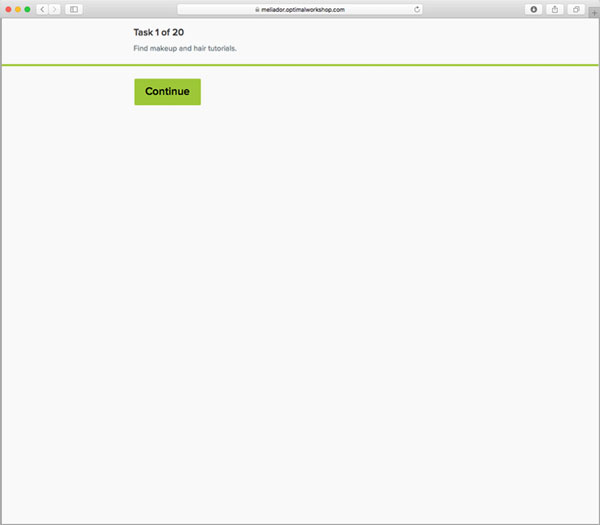
Next, all 20 “stimuli x task” combinations were presented in a randomized order. Task instructions were presented on the screen to each participant one at a time. Once the participant read the task and was ready to continue, they selected a ‘Continue’ button which would start the timer and display the stimuli. Participants then clicked with their mouse where on the screen they felt they would find the information stated in the task. Immediately on this click, the timer would stop and then move the participant onto a screen with two questions—one about ease of use and one about efficiency. Both questions provided a 5-point Likert scale rating for participants to select from. Once finished, the participant would then continue onto the next task and repeat this cycle again.
After the participant completed all tasks, they were asked about their previous knowledge of these companies and for feedback on each stimuli. Once finished answering these questions, participants were brought to a screen which thanked them for their participation and stated the test was complete.


EVALUATION MEASURES
Qualitative Data Collected
- Participants’ answers to warm-up and wrap-up questions
Quantitative Data Collected
- Task completion success rate
- Total time of successful completion
- Ease of use rating for each task
- Efficiency rating for each task
.
Findings
A/B testing results for each participant were compiled and analyzed for each task. The Sephora and Ulta Beauty homepages were then compared using statistical tests to determine significance. For each task, findings included:
- Task Completion
- Time on Task
- Ease of Use Rating
- Efficiency Rating
All findings for the 10 tasks were presented in the report similar to the examples below:
PRODUCT TASK FINDINGS
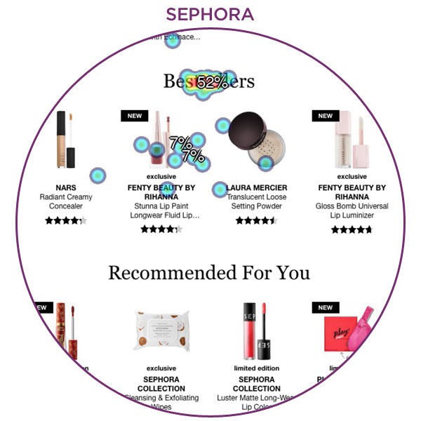
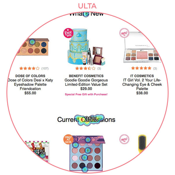
Product Task 1: Find the most popular items purchased by customers
- Task Completion
We conducted a Fisher Exact Test to compare the task completion rate of Sephora’s homepage (83%) to the task completion rate of Ulta’s homepage (59%). The completion rates were significantly different (p = .02), such that more participants successfully completed the task when using Sephora’s homepage than when using Ulta’s homepage.
- Time on Task
We conducted a paired t-test to compare the time on task between the Sephora and Ulta homepages. We found a significant difference (t(26)= -3.12, p = .004), such that participants took longer to complete the task when using Ulta’s homepage (M = 20.2s, SD = 15.7s) than when using Sephora’s homepage (M = 10.4s, SD = 6.7s).
- Ease of Use Rating
We conducted a paired t-test to compare the ease of use ratings participants assigned to the Sephora and Ulta homepage variations. We found a significant difference (t(26)= 3.61, p = .001), such that participants rated the ease of use lower when using Ulta’s homepage (M = 3.6, SD = 1.1) than when using Sephora’s homepage (M = 4.4, SD = 0.7).
- Efficiency Rating
We conducted a paired t-test to compare the efficiency ratings participants assigned to the Sephora and Ulta homepage variations. We found a significant difference (t(26)= 3.25, p = .003), such that participants rated efficiency lower when using Ulta’s homepage (M = 3.8, SD = 1.1) than when using Sephora’s homepage (M = 4.4, SD = 0.8).
- Summary of Results
When participants were tasked with finding the most popular items purchased by customers using both stimuli, the Sephora homepage was better than the Ulta homepage in all significant measured results. With Sephora’s homepage, participants successfully completed the task at a rate over 20% higher than Ulta’s, spent an average of 10 seconds less time completing the task, and rated it higher in both ease of use and efficiency.


Product Task 2: Find the company's own collection of products
- Task Completion
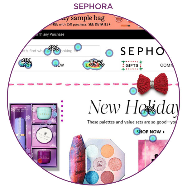
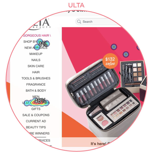
We conducted a Fisher Exact Test to compare the task completion rate of Sephora’s homepage (41%) to the task completion rate of Ulta’s homepage (48%) and found no statistically significant difference at alpha level .05.
- Time on Task
We conducted a paired t-test to compare the time on task between the Sephora and Ulta homepages. We found a significant difference (t(11)= 2.46, p = .03), such that participants took longer to complete the task when using Sephora’s homepage (M = 24.4s, SD = 12.8s) than when using Ulta’s homepage (M = 11.8s, SD = 8.6s).
- Ease of Use Rating
We conducted a paired t-test to compare the ease of use ratings participants assigned to the Sephora and Ulta homepage variations. We found a significant difference (t(11)= -2.92, p = .01), such that participants rated the ease of use lower when using Sephora’s homepage (M = 3.3, SD = 1.4) than when using Ulta’s homepage (M = 4.5, SD = 0.7).
- Efficiency Rating
We conducted a paired t-test to compare the efficiency ratings participants assigned to the Sephora and Ulta homepage variations. There was no significant difference between the efficiency ratings for Sephora’s homepage (M = 3.5, SD = 1.2) and Ulta’s homepage (M = 4.2, SD = 1.4) at alpha level .05.
- Summary of Results
When participants were tasked with finding the company’s own collection of products using both stimuli, no statistically significant difference was found for either task completion or efficiency rating. However, time on task and ease of use rating were determined to be significantly different. Participants took an average of over 12 seconds longer to complete the task using Sephora’s homepage, and they also rated the Sephora homepage ease of use lower by an average of 1.2. Therefore, Ulta’s homepage fared better on two measures during this task.


Product Task 3: Find haircare products
- Task Completion
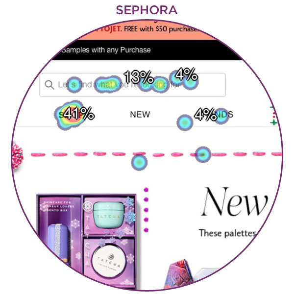
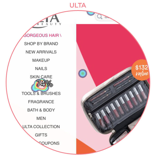
We conducted a Fisher Exact Test to compare the task completion rate of Sephora’s homepage (41%) to the task completion rate of Ulta’s homepage (74%). The completion rates were significantly different (p = 0.003), such that more participants successfully completed the task when using Ulta’s homepage than when using Sephora’s homepage.
- Time on Task
We conducted a paired t-test to compare the time on task between the Sephora and Ulta homepages. We found a significant difference (t(17)= 3.56, p=0.003), such that participants took longer to complete the task when using Sephora’s homepage (M = 20.3s, SD = 12.5s) than when using Ulta’s homepage (M = 7.2s, SD = 6.8s).
- Ease of Use Rating
We conducted a paired t-test to compare the ease of use ratings participants assigned to the Sephora and Ulta homepage variations. We found a significant difference (t(17)= -3.56, p = 0.003), such that participants rated the ease of use lower when using Sephora’s homepage (M = 2.9, SD = 1.2) than when using Ulta’s homepage (M = 4.4, SD = 0.9).
- Efficiency Rating
We conducted a paired t-test to compare the efficiency ratings participants assigned to the Sephora and Ulta homepage variations. We found a significant difference (t(17)= -3.51, p = 0.003), such that participants rated efficiency lower when using Sephora’s homepage (M = 3.1, SD = 1.3) than when using Ulta’s homepage (M = 4.5, SD = 0.9).
- Summary of Results
When participants were tasked with finding haircare products using both stimuli, the Ulta homepage was better than the Sephora homepage in all significant measured results. With Ulta’s homepage, participants successfully completed the task at a rate 33% higher than Sephora’s, spent an average of 15 seconds less time completing the task, and rated it higher in both ease of use and efficiency.


SERVICE TASK FINDINGS
Service Task 1: Find if there is a location near you
- Task Completion
We conducted a Fisher Exact Test to compare the task completion rate of Sephora’s homepage (78%) to the task completion rate of Ulta’s homepage (80%) and found no statistically significant difference at alpha level .05.
- Time on Task
We conducted a paired t-test to compare the time on task between the Sephora and Ulta homepages. There was no significant difference between the time on task for Sephora’s homepage (M = 5.8s, SD = 5.3s) and Ulta’s homepage (M = 5.0s, SD = 4.2s) at alpha level .05.
- Ease of Use Rating
We conducted a paired t-test to compare the ease of use ratings participants assigned to the Sephora and Ulta homepage variations. There was no significant difference between the ease of use ratings for Sephora’s homepage (M = 4.5, SD = 0.8) and Ulta’s homepage (M = 4.6, SD = 0.8) at alpha level .05.
- Efficiency Rating
We conducted a paired t-test to compare the efficiency ratings participants assigned to the Sephora and Ulta homepage variations. There was no significant difference between the efficiency ratings for Sephora’s homepage (M = 4.4, SD = 0.8) and Ulta’s homepage (M = 4.7, SD = 0.6) at alpha level .05.
- Summary of Results
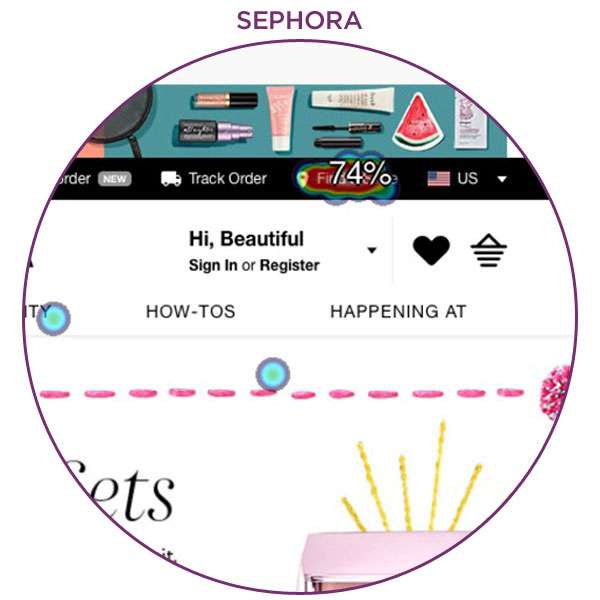
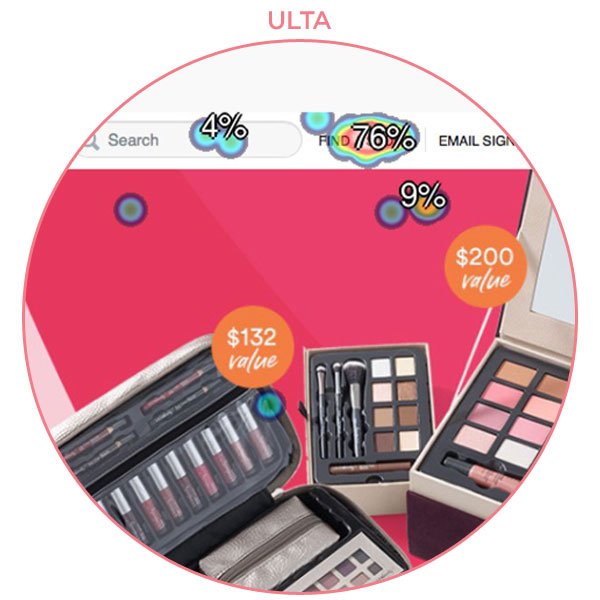
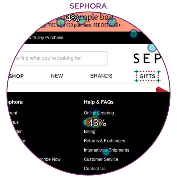
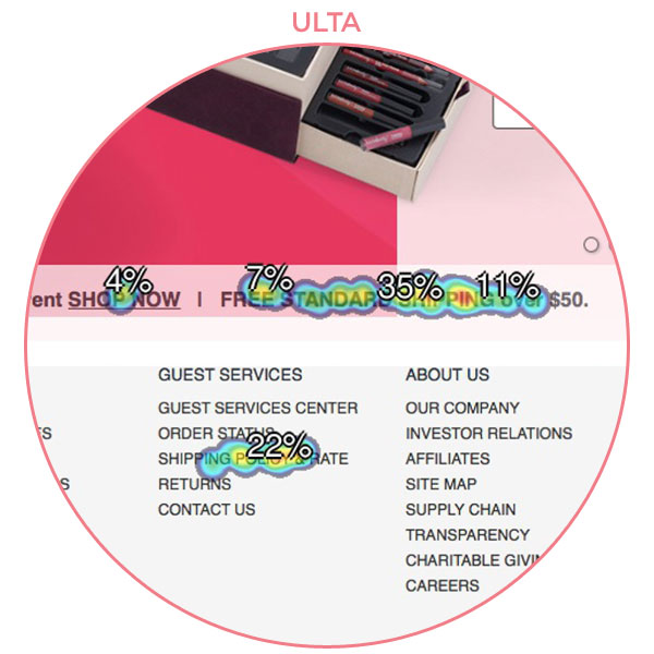
When participants were tasked with finding a location near them using both stimuli, no statistically significant difference was found for any of the measures. A possible cause of this could be the similar location of what was considered a successful click. In both stimuli, “Find a Store” was located in the top navigation bar. Participants may also have been familiar with this task location since it has become standard across many different websites to have this item along the top of the website screen.


Service Task 2: Find the company's Instagram account
- Task Completion
We conducted a Fisher Exact Test to compare the task completion rate of Sephora’s homepage (74%) to the task completion rate of Ulta’s homepage (74%) and found no statistically significant difference at alpha level .05.
- Time on Task
We conducted a paired t-test to compare the time on task between the Sephora and Ulta homepages. There was no significant difference between the time on task for Sephora’s homepage (M = 11.1s, SD = 10.3s) and Ulta’s homepage (M = 13.1s, SD = 36.1s) at alpha level .05.
- Ease of Use Rating
We conducted a paired t-test to compare the ease of use ratings participants assigned to the Sephora and Ulta homepage variations. There was no significant difference between the ease of use ratings for Sephora’s homepage (M = 4.1, SD = 1.1) and Ulta’s homepage (M = 4.4, SD = 0.8) at alpha level .05.
- Efficiency Rating
We conducted a paired t-test to compare the efficiency ratings participants assigned to the Sephora and Ulta homepage variations. There was no significant difference between the efficiency ratings for Sephora’s homepage (M = 4.0, SD = 1.1) and Ulta’s homepage (M = 4.3, SD = 0.9) at alpha level .05.
- Summary of Results
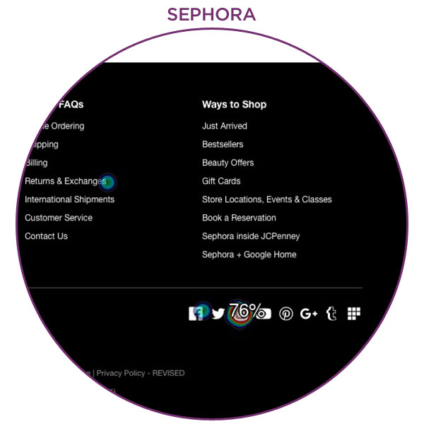
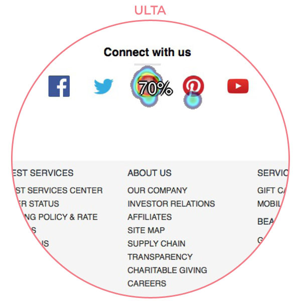
When participants were tasked with finding the company’s Instagram account using both stimuli, no statistically significant difference was found for any of the measures. While one participant stated it “can be hard to find certain links like their social media,” most participants found the links to be “visible” and “easy to find.”


Service Task 3: Find how much you have to spend to get free standard shipping
- Task Completion
We conducted a Fisher Exact Test to compare the task completion rate of Sephora’s homepage (41%) to the task completion rate of Ulta’s homepage (74%). The completion rates were significantly different (p = .003), such that more participants successfully completed the task when using Ulta’s homepage than when using Sephora’s homepage.
- Time on Task
We conducted a paired t-test to compare the time on task between the Sephora and Ulta homepages. We found a significant difference (t(16)= 4.54, p = .0003), such that participants took longer to complete the task when using Sephora’s homepage (M = 29.1s, SD = 19.4s) than when using Ulta’s homepage (M = 10.1s, SD = 5.0s).
- Ease of Use Rating
We conducted a paired t-test to compare the ease of use ratings participants assigned to the Sephora and Ulta homepage variations. We found a significant difference (t(16)= -4.83, p = .0002), such that participants rated the ease of use lower when using Sephora’s homepage (M = 3.0, SD = 1.1) than when using Ulta’s homepage (M = 4.3, SD = 0.9).
- Efficiency Rating
We conducted a paired t-test to compare the efficiency ratings participants assigned to the Sephora and Ulta homepage variations. We found a significant difference (t(16)= -4.51, p = .0003), such that participants rated efficiency lower when using Sephora’s homepage (M = 2.9, SD = 1.1) than when using Ulta’s homepage (M = 4.1, SD = 0.9).
- Summary of Results
When participants were tasked with finding how much they would have to spend to get free standard shipping using both stimuli, the Ulta homepage was better than the Sephora homepage in all significant measured results. With Ulta’s homepage, participants successfully completed the task at a rate over 30% higher than Sephora’s, spent an average of 19 seconds less time completing the task, and rated it higher in both ease of use and efficiency.


PREFERENCE FEEDBACK
Preference/Favorability
We conducted a Fisher Exact Test to compare which homepage participants preferred more between Sephora’s homepage (59%) and Ulta’s homepage (33%). The rates were significantly different (p = .02), such that more participants preferred Sephora’s homepage than Ulta’s homepage.
27 out of 46 participants preferred Sephora’s homepage, while 15 participants preferred Ulta’s homepage. Four participants had no response or felt indifferent.
Information Design Versus Visual Styling
A unified impression on each homepage strength is shared among all participants. Sephora’s homepage stands out by its visual and color styling. One participant commented, “[Sephora] has a fun experience. It made me want to stay on longer and explore more with the fun colors and borders throughout.” While another stated, “I liked the look and feel of the Sephora page more overall. It was more inviting and showed off the products better, and the look was more clean and polished. The Ulta page had more information right up top, but the look was a little outdated in my opinion.” Participants favored Ulta’s homepage because of the functionality of its navigation menu on the left. Ulta’s navigation menu offers more categories and it is easier to navigate. Ulta’s homepage “conveys the information more effectively.” Another participant said they prefer, “Ulta, because I find it easier to navigate.”
.
.
Retrospective
NO SIGNIFICANT DIFFERENCE WHEN COMPARING ALL TASKS
Our study aimed to investigate if the Sephora homepage helps users find information on products and services more efficiently than the Ulta Beauty homepage. We designed 10 tasks that equally represent product and service information. The research used four measurements: (1) Task Completion; (2) Time on Task; (3) Ease of Use Rating; and (4) Efficiency Rating. We compared the two homepages with data from 46 participants. After completing this study, we have found Sephora and Ulta performed similarly across the four measurements, for both product and service categories and overall.
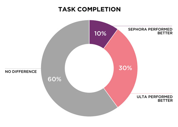
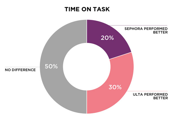
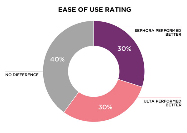
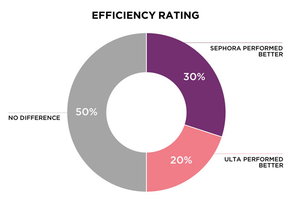
When looking at overall data for all tasks, for task completion, the Ulta homepage had better statistically significant results 30% of the time, while the Sephora homepage only had better results 10% of the time. For time on task, the Ulta homepage had better statistically significant results 30% of the time, while the Sephora homepage had better results 20% of the time. The Sephora homepage and the Ulta homepage had equally better ease of use rating results at 30% of the time. For efficiency ratings, the Sephora homepage had better statistically significant results 30% of the time, while the Ulta homepage only had better results 20% of the time.


PARTICIPANTS PREFERRED SEPHORA OVERALL
Even though there was no statistically significant difference between the Sephora and Ulta homepage for the tasks, our study did find a significant difference in preference of one homepage over another (p = .02). Participants preferred Sephora’s homepage more when questioned, after completing the test. Based on the qualitative feedback, we found that Sephora’s brand look left a better impression on participants over Ulta’s brand look.
NAVIGATION MENU REDESIGN RECOMMENDED
Sephora’s strength seems to be in the visual styling. Participants praised its color choice and page layout, and how it conveys Sephora’s young, fun, and up-to-date spirit seamlessly. Despite the effort in styling, participants did have negative feedback about Sephora for a common reason—they found Ulta’s navigation menu on the left more useful and easy to use. Even with a similar information architecture, Sephora’s menu did not convey the same structural impression. Instead of displaying the categories up front, the subcategory only shows up once the mouse hovers over. We believe that Sephora can advance their competitiveness by redesigning the navigation menu. Further card sorting is recommended to organize and create a clearer navigation tool that offers more options for customers.
.
.
If you would like to read more, click below to view the full report.
Sephora & Ulta A/B Study Full Report
