Route Roulette is a fun multi-channel service that helps users easily decide what types of activities to do in their spare time based on location and personal preferences. The goal of this project was to create a tool for those looking for a new adventure either locally where they live or when visiting a new city. The proposed product would immediately provide activities tailored to user’s preferences along with all needed information. This would enable users to plan less and do more. UX & Product Designer Jan – Mar 2017 • 4 Team MembersOverview
Role & Duration
Researcher
Areas of Focus: Visual Design, UX Design, Interaction Design, User Research
Many activity-based services available today require a lengthy set-up process, cannot be customized to the user’s preferences, and do not provide an option for a spontaneous adventure.
In addition, current products typically treat an activity as only traveling from point A to point B, when in reality these activities can include a large amount of pre-planning, multiple stages or events, various methods of travel, and added confusion when there are unexpected changes to the itinerary. All of these increase cognitive load on the user, which in turn can create an overall negative experience.
To gain an understanding of the users and product scope, the team started research on the topic by reading published articles and by conducting a competitive analysis. We discovered that planning a trip can be complicated and stressful for many people and requires a large amount of planning both before and during an activity. Users typically have to look at multiple sources to get all of the needed information.
Our competitive analysis revealed many different categories of activity planning apps, such as those featuring outdoor adventures, road trips, and distant vacations. However, none were found that allowed users to make detailed plans for a wide variety of local activities. There were also no solutions that provided an option for a random or spontaneous adventure.
Activity planning is complicated and stressful especially when there are multiple stages, various methods of travel, and unexpected changes.
Many current solutions feature only certain types of activities, so if a user wanted to try a different activity, they would have to search elsewhere.
Most solutions were found to be lacking personalization capabilities which in turn could add unnecessary or wasted time to a user’s search.
Many users prefer to view a high amount of details when planning activities, but current solutions are lacking in amount and type of information.
Based on our gained knowledge from the literature review and competitive analysis, we created user personas to guide our future design decisions and priorities.
Our next step was to tell a story through the user scenarios we created based our personas. This helped us understand what a typical user may be thinking and experiencing while planning an activity and how the user might actually use our designed product. These scenarios were also used to explain the proposed user path to stakeholders. The example scenario below was based on the Evan the Explorer persona for the mobile app.
Evan has some free time today, and decides he wants to plan a one-day trip for him and his family, so he opens the Route Roulette app on his mobile phone. On the home screen, he sees three recommended trips provided by the app that fit his previously-entered preferences. He also sees the most popular trips and the trips nearest to his current location.
Since he cannot decide on what to do, Evan has chosen to view a random trip. The first choice that comes up happens to be a featured activity with discounts for visitors. Evan reads through the details, comments, and reviews. He determines it sounds like a great choice for him and his family. He then taps the ‘Select’ button to start his activity.
Evan reviews the details once more by swiping through each stop on the way, which are highlighted on the map as he views them. Evan uses the map screen to navigate to his first stop of the activity, while also getting a look at what’s nearby. If he sees something else he would like to do along the way, he can easily select it and add it to the itinerary.
After arriving back home, Evan selects ‘Finish’ to stop the navigation for his family trip. A new screen comes up asking him to rate his overall experience. He also decides to enter comments about today’s activity. Once all of the information is filled in, he taps the ‘Submit’ button and his review is posted to the activity listing for other users to view!
The personas and user scenarios helped guide and focus our ideation processes. As a group we identified potential features, ideas for monetization, and design principles for the website and mobile products.
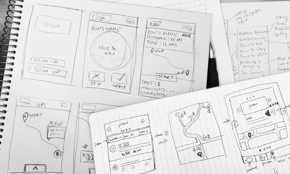
Sketches were created using the information from our personas, user scenario, and feature list. Each team member sketched basic ideas. We then had a discussion and collaborated to create the first set of basic wireframes.
.


With a basic idea in mind of how the screens should function, as well as initial wireframes of the interface, we created an interactive low-fidelity prototype that followed common task flows, for both a mobile interface as well as a desktop web interface.
Usability testing was completed using the low-fidelity prototypes. Eligible participants had previously planned and took part in an activity or trip. The objectives of the test were to:
1. Assess the usability level of basic website and app functions.
2. Obtain quantitative and qualitative insights on how users interact with the website and app during specified tasks.
For the mobile prototype, participants were asked to complete tasks related to editing their trip preferences and completing a random trip. On desktop, they were asked to complete tasks related to setting up their trip preferences and browsing available trips.
Results from the usability study were positive overall and 100% of participants were able to successfully complete all tasks without error. Some feedback included:
• The term ‘explore’ caused confusion.
• There should be options for other modes of transportation for those without a car.
• Price ranges should be included as a filtering option and estimated costs should be emphasized more.
• The overall layout of the website and mobile app was well-liked by participants.
• A frequent comment was that “things made sense” to participants.
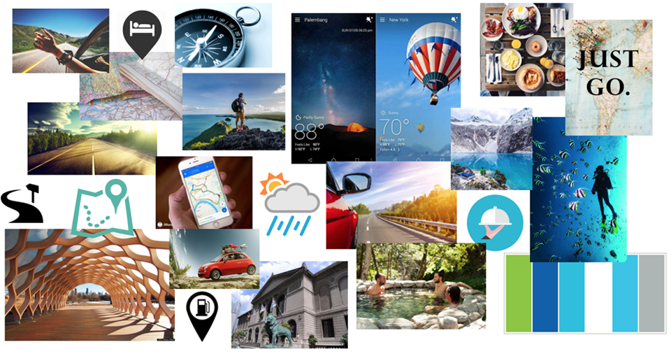
Team members contributed ideas to a shared mood board that would serve to influence the look and feel of the interface going forward—our vision was something that felt whimsical, active, and outdoorsy.

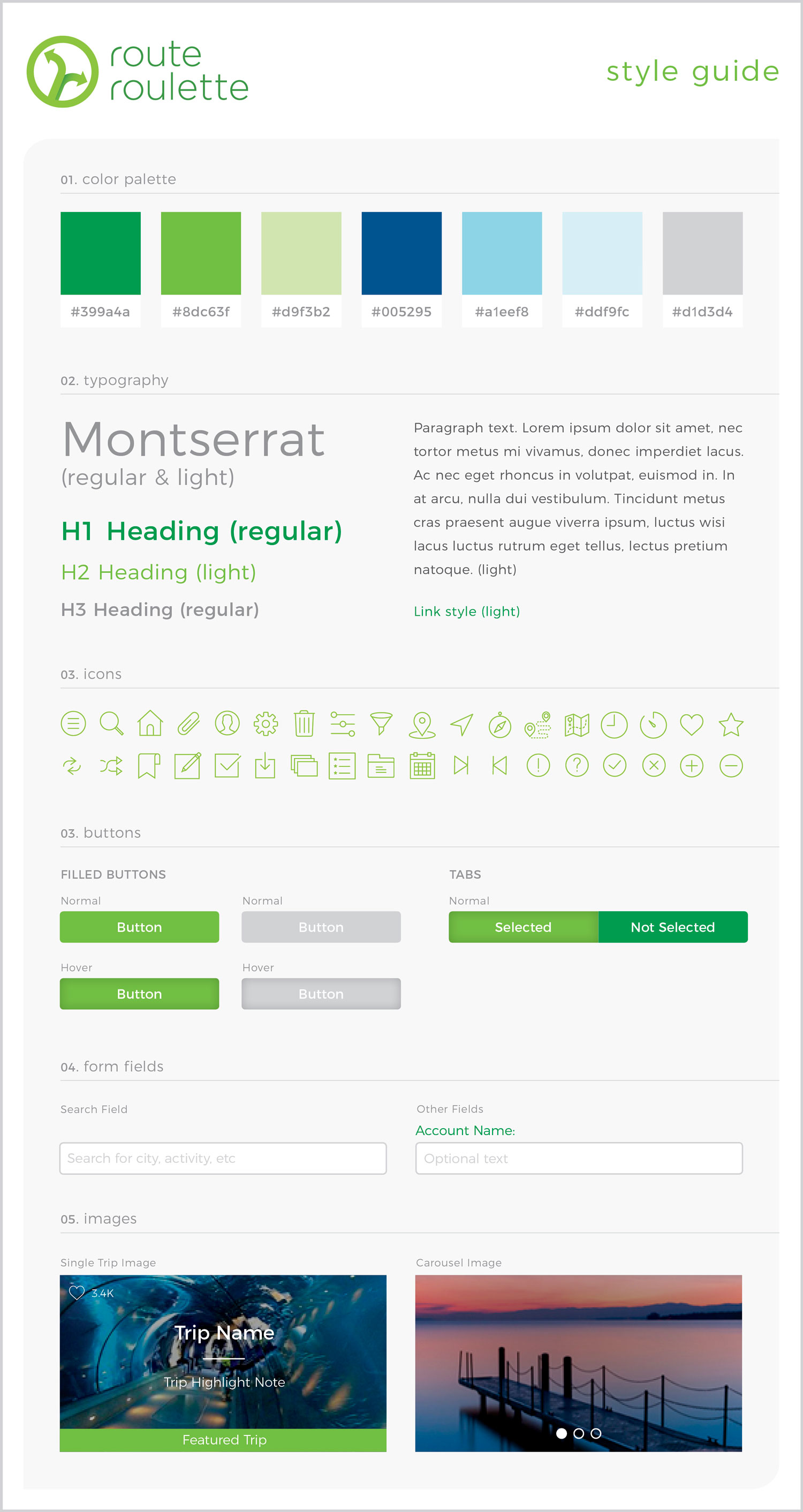
A logo and style guide were created to promote a uniform experience throughout both mobile and web channels.

Based on feedback from participants during the usability study, changes were made to the layout and information architecture on the high-fidelity prototypes. The overall design was driven by the style guide.
During this project, our team sought to improve the activity planning experience. By alleviating some of the planning complexity, and including more variety, personalization, and details, our solution supported a more relaxing and enjoyable experience for users. We included an option for a spontaneous adventure—which other current products are missing—which helped decrease cognitive load while also providing an instant answer to “what is there to do?”
.
.
.
Email me or fill out the contact form linked below.
Contact Me