Accommodate Mate is a housing search tool which aims to make it easier for people with disabilities to find and keep housing, as well as allow people to get additional support and answers regarding property listings. Our mission was to connect people in the Chicago area with verified, accurate information to help them find accessible housing that suits their individual needs. UX Designer & Researcher Jan – Mar 2020 • 3 Team MembersOverview
Role & Duration
Project Manager
Areas of Focus:
Visual Design, UX Design, Product Design, Interaction Design, User Research, Project Management
According to the 2000 Census, over 600,000 Chicago residents—approximately 23% of the city’s total population—reported having a disability. Many Chicagoans with disabilities encounter obstacles during their search for accessible housing, including a lack of support, a limited number of accessible housing options, and missing definitions of what is considered accessible.
Civil rights laws such as the Americans with Disabilities Act (ADA) have helped make public spaces more accessible to more Americans; however, improved access on private property, especially residential housing, remains largely unrealized. Current digital solutions in the housing space are limited, often lack accessibility-related features, and have inadequate or inaccurate information.
To understand the current challenges people face when searching for housing with accessible features in the Chicago, Illinois area, we conducted a literature review and competitive analysis. Academic and non-academic articles and online media were reviewed and used to support and shape our user research and identify current gaps. We discovered that many Chicagoans with disabilities encounter obstacles during their search for accessible housing.
Our competitive analysis revealed no solutions in the mobile app space that focus on accessible housing, a lack of accessibility-related features and filters on all widely used real estate search tools, and a consistent theme of unclear or missing information.
.
Our vision was to improve on existing housing search tools with an accessibility-first approach. Therefore, it was critical for us to achieve participant diversity during the user interviews in order to fully define the problem space we were hoping to improve. For the user interviews, all four participants were people with physical disabilities, including two wheelchair users, one person who is blind, and one person with an ambulatory disability.
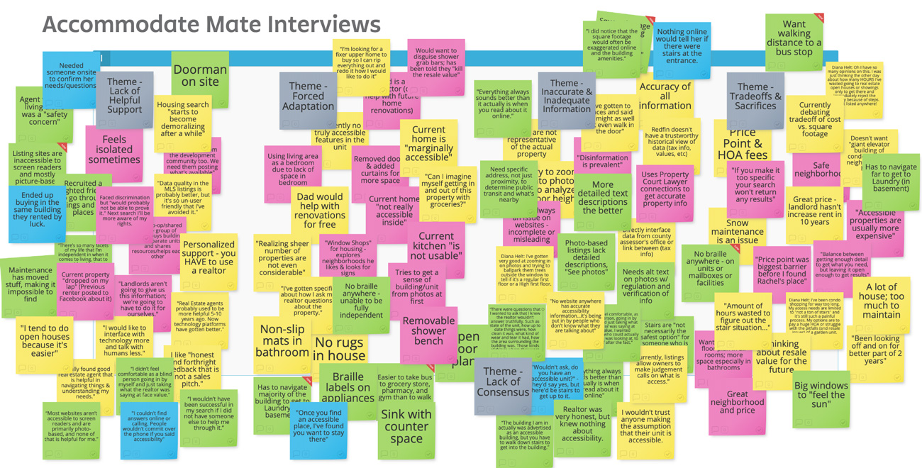
Using affinity diagramming, we categorized our findings into themes related to our stated project goal to uncover current challenges users experience when finding housing, digitally and offline.

Individuals attempted to get support during their housing search from a variety of sources, both online and offline, but often found those sources to be unsatisfactory, dishonest, uncaring, and even discriminatory. Almost all participants reported feelings of frustration and isolation during their housing search experience attributed to a lack of support.
Participants reported having adapted to multiple aspects of their current housing situation and recognized the likely scenario of needing to adapt to future housing. The need for modifications to living environments was also discussed frequently. Some of these modifications were simple, while others were complex and difficult to implement.
Most resources were found to be lacking even the most basic of details, and those that included an acceptable amount of information were full of inaccuracies. Participants stated they had to use multiple methods to obtain and verify information, which increased the amount of search time. In addition, many resources lacked web accessibility.
All individuals noticed a lack of knowledge and unclear definitions surrounding what is considered accessible housing. This was reflected in the information they typically received about a property. On multiple occasions, participants reported a property was advertised as accessible, only to visit it and be unable to enter the building.
Price and location were the two most common areas of importance during all participant’s housing search. Since there are typically a very limited number of options available that fit both criteria, making trade-offs is a frequent occurrence. Accessible properties were found to be more expensive, so sacrifices had to constantly be made.
.
Our domain expert interviews, in which we interviewed employees of Access Living Chicago, highlighted systemic and societal issues, and the overall poor state of accessible housing in Chicago. The problems discussed are prevalent in the housing industry and have many far-reaching consequences, many of which can only be addressed at the government level. These included the limitations of the Americans with Disabilities Act (ADA), an absence of laws addressing private housing accessibility, and vague or confusing laws that have a varying set of standards, such as Section 504 of the Rehabilitation Act of 1973 and the Fair Housing Act (FHA).
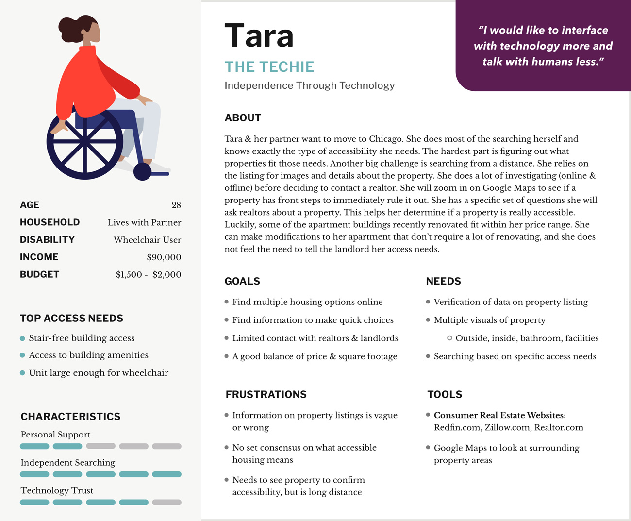
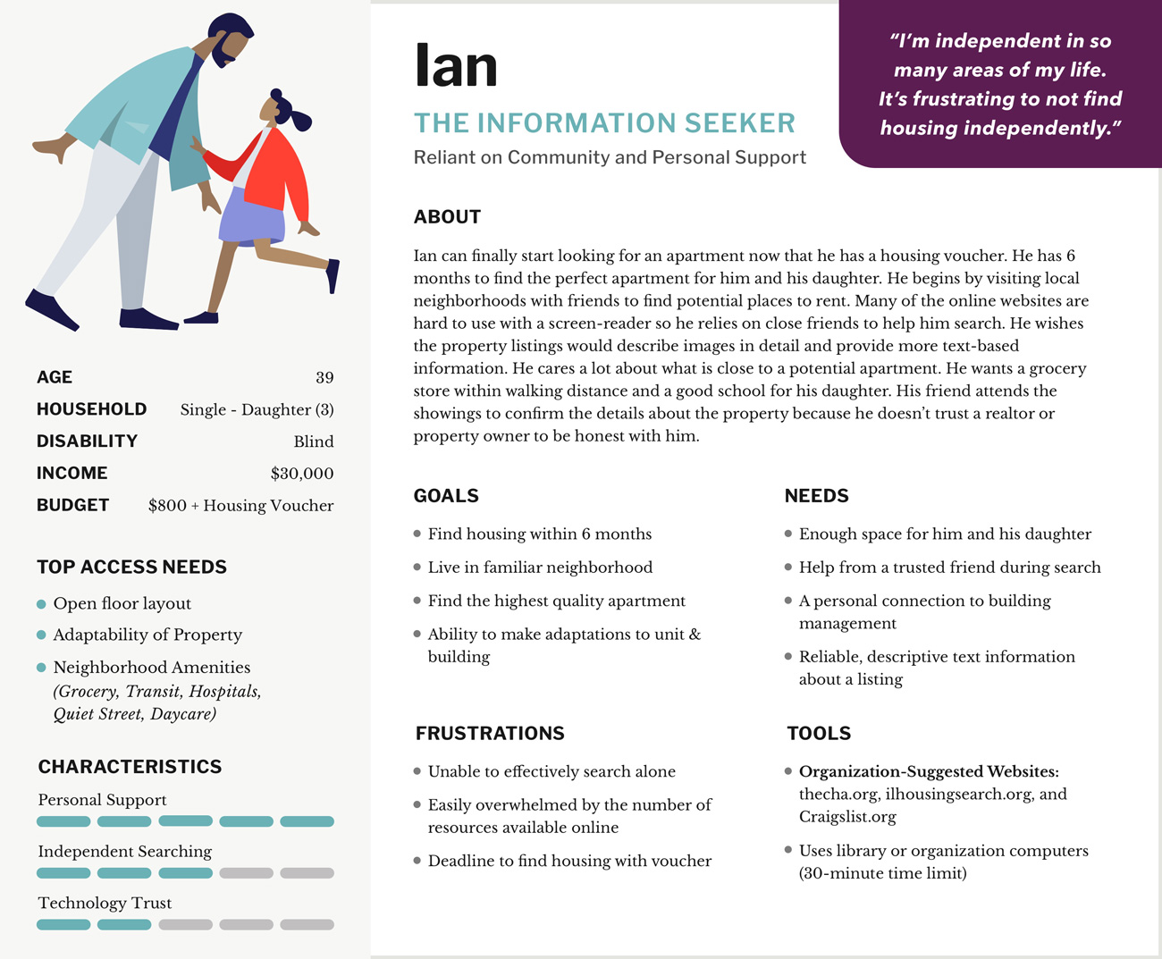
Using the qualitative data from user interviews, two personas were created to define the users we were designing for and their needs, frustrations, and goals.


An experience map was used to document how the people we interviewed currently search for accessible housing using the current resources available to them and their experiences, feelings, and behaviors during this journey. Opportunities for improvement were highlighted.
The personas and experience map helped guide and focus our ideation processes. Potential features were identified for our technology-based solution and were aligned directly to findings through the personas. Each feature was assigned a priority, impact and feasibility rating. All features fit into one of five categories which align to previous user interview insights.
A preferred listing of agents with verified experience in accessible housing is featured. Property listings include Q&A and reviews. While visiting properties, users can take their own photos and notes and save them privately to their user account or choose to share them publicly.
An augmented reality feature allows users to view possible modifications through a mobile device’s live camera or still photos. Using the visual information available, the feature can supply the room measurements, show what the modification can look like, and provide an estimated cost.
Property listing information includes a rich text description, an end-to-end visual walkthrough, a detailed description and images of the surrounding neighborhood, alt text on all images, and screen reader support. All information is verified and peer-reviewed by those with accessibility knowledge.
When adding a new property, agents are required to include details related to accessibility. These required form fields will be featured along with explanations to help educate listing agents. This should help support a consensus of what accessibility means since the focus is on the details.
A robust search engine with a wide range of filters, which include accessibility-related features, could help users determine the best trade-offs based on their personal needs. Location-based features to view properties near the user and those close to community resources are also included.
User flow diagrams were created to show the steps a user would take to complete an important context-based task of an experience we aimed to improve. A total of four diagrams were designed—two for desktop, two for mobile—which focused on proposed features that had the highest level of impact and feasibility, and which could be created and tested within our time frame and aligned to usability study goals.
Low-fidelity prototypes of our desktop and mobile solution were created to follow the paths identified in the user flow diagrams. Both prototypes included a home or main screen, various forms of interactivity to filter housing results, and a listing screen with property details and capabilities to support a personalized housing search.
The goal of this study was to evaluate and address any major design issues and to collect qualitative data to inform improvements for the high-fidelity prototypes.
Participants were able to interact with the prototypes with minimal issues, and no major design or functionality failures were found. We categorized our findings into two themes.
Participants discussed the need for more details throughout the desktop and mobile prototypes and during all tasks, but felt this was especially needed on the property listing page.
How these details were organized was just as important to participants. It was suggested that the screen organization should closely follow popular real estate search tools.
A brand identity and style guide were created to set standards for upcoming designs of high-fidelity prototypes. A logo was developed, along with a high-contrast color palette that adheres to Web Content Accessibility Guidelines (WCAG 2.1) recommended by the World Wide Web Consortium (W3C).
Creation of high-fidelity prototypes for desktop and mobile were guided by previous exploratory usability study results and the style guide. The screens initially created for the low-fidelity prototypes were redesigned, more details were added to the listing page, and design patterns used in current popular real estate search tools were followed more closely to inform the overall layout and functionality.
During the formal usability study, our priority was to evaluate the usability, content, and overall satisfaction of our high-fidelity desktop and mobile prototypes. We included participants with disabilities and without disabilities in an effort to understand how our tool would be received by our target audience and a broader population. Both quantitative and qualitative data was collected. Our goals for the formal usability study were to:
1. Ensure the user is successfully able to filter housing search criteria.
2. Ensure the user is able to find sufficient details about a property to make an informed decision.
3. Ensure the user is satisfied with their ability to find housing using the project product.
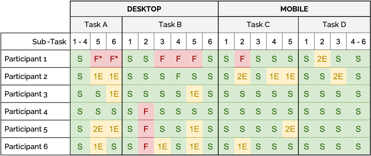
Participants completed four sets of tasks and the rate of success, partial success (success with errors), and failure were recorded. Most participants successfully completed each task without error; however, there were a few occurrences of partial success or failure.
Participant Task Completion on Desktop and Mobile:

S = Success with no errors
#E = Partial success with errors
F = Task failure
F* = Failure caused by technical issue that was corrected
Many participants enjoyed the high level of detail overall. However, one participant stated it was too high, even going as far to say that they would not use the product again.
Minor issues were reported by participants throughout completion of tasks. Although most of these did not affect the rate of task completion, it is important these are fixed.
Overall, participants showed enthusiasm for all proximity search features, from completing the questionnaire on desktop to viewing resources on the mobile map view.
Participants also enjoyed personalized listing features. Peer reviews and the functionality for users to add their own photos and notes should be refined and expanded.
Many participants appreciated the ability to search using accessibility-related features alongside the integration of common real estate design patterns.
Participants rated their overall satisfaction with each prototype using the Customer Satisfaction Score (CSAT) after completing the tasks. Participants were asked to choose a number on a scale of 1 (very unsatisfied) to 5 (very satisfied). The majority of participants rated both the desktop and mobile prototypes a 5, with few exceptions.
Participant Rating of Satisfaction (CSAT) on Desktop and Mobile:

In this project, we sought to improve the process of discovering accessible housing. Our goals included uncovering the current challenges users face during their housing search, and ensuring users are successfully able to filter housing search criteria, find sufficient details about a property, and are satisfied with their ability to find housing using our proposed product.
We identified that a lack of accurate information and consensus about accessible housing features contributed to a frustrating experience. Users we spoke with had to make sacrifices or trade-offs and prioritize or adapt to different accessibility needs. A lack of helpful support negatively affected the entire housing search experience. Therefore, ensuring our users were able to use our proposed product to make an informed decision was critical.
Our two rounds of usability testing revealed we had mostly succeeded in ensuring users were able to filter housing search criteria, find sufficient details about a property, and were satisfied with their ability to find housing. Participants were enthusiastic about the idea of personalized and proximity search features, and the ability to have access to verified, accurate information.
Over the course of this project, we found that not only is there a severe lack of accessible housing but finding any properties with basic accessibility takes time and a bit of luck. Our proposed product does not try to ignore the fact that without sweeping changes to the housing market, the problem cannot be solved entirely. Our hope was to demonstrate an abundance of features that can be implemented in a new tool—or existing tools—to empower people with disabilities to find accessible properties more easily than before.
.
.
Email me or fill out the contact form linked below.
Contact Me