Expert evaluations involve a review of a product or system, usually by a usability or human factors specialist who has little or no involvement in the project. The review is performed according to accepted usability principles or heuristics from previous research and professional experience. Compared to user studies, expert evaluation often saves time and costs, and is easier to arrange. Basic problems can be found and then avoided by conducting an expert evaluation before a user study.
The below details an expert evaluation of the Microsoft HealthVault website.
.
According to Microsoft, HealthVault.com is a “platform for business and consumers to store personal health information – and then generate insights from it.” In using this application, the goal for users is for them to “take charge of their and their family’s health and make more informed health decisions.”
The objective for this evaluation was to assess the HealthVault application as a consumer-type user in the order in which it would typically be visited (chronological order), and define possible usability issues and positive findings. The key task flow for a consumer-type user would consist of arriving at the website home page, learning about HealthVault, signing in or creating an account, and then starting to set up a health profile by using the “Let’s get started” pop-up window which was displayed on the top of the account home page.
Four team members explored the Microsoft HealthVault website individually to gain some familiarity and understanding of the product. The team shared their personal findings and prioritized the scope mentioned above. This assessment was completed by team members using the Safari or Chrome browser on either a desktop or laptop computer.
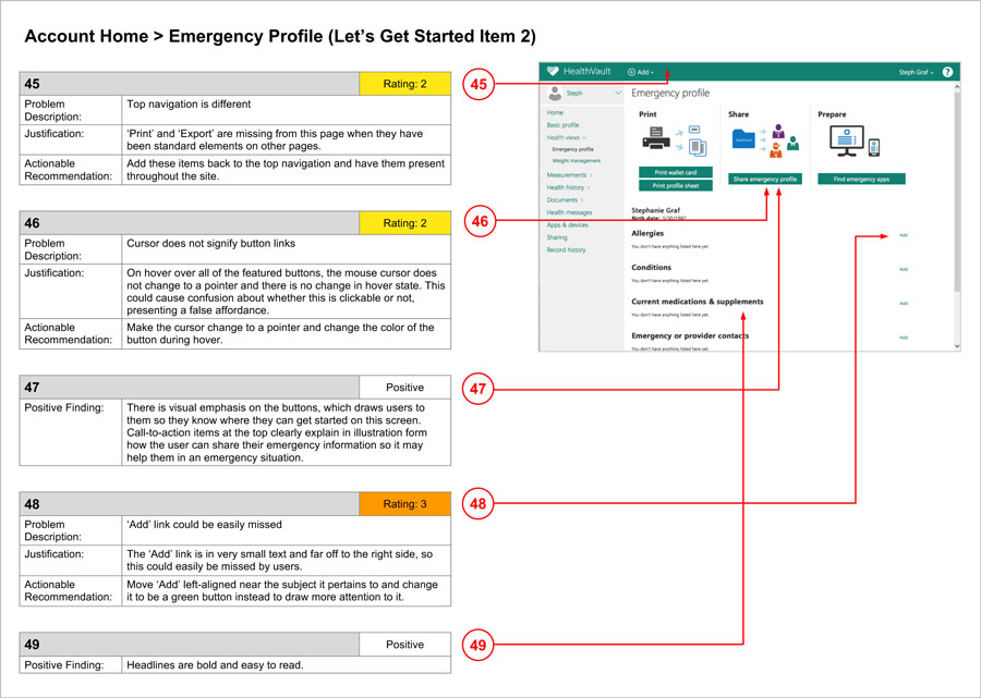
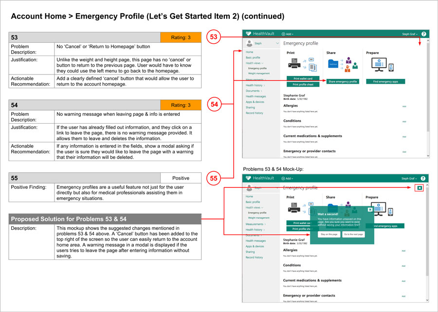
Usability results were defined and presented for each screen of the HealthVault application. The results consist of (a) Problem Description – What is the problem?; (b) Problem Justification – Why is this a problem? How does it impact users?; and (c) Actionable Recommendation – How can we fix the problem? Positive findings about each screen are also noted. Team members then compiled their individual ratings for each identified problem by using the severity rating below and the average of those ratings, rounded to the nearest whole number, was added to each reported problem.
The severity rating is a 0 to 4 scale, which includes the prioritization of issues as follows:
.
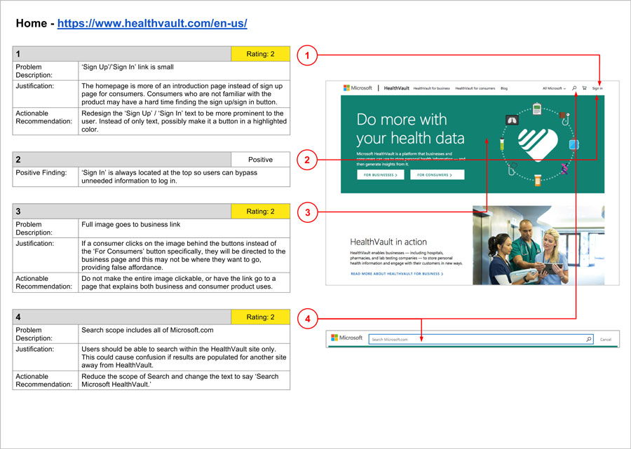
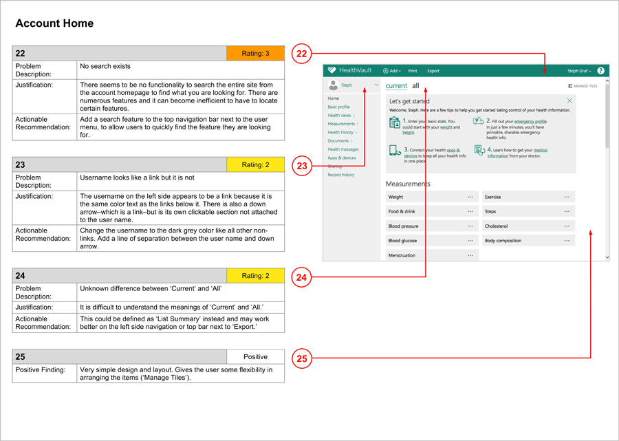
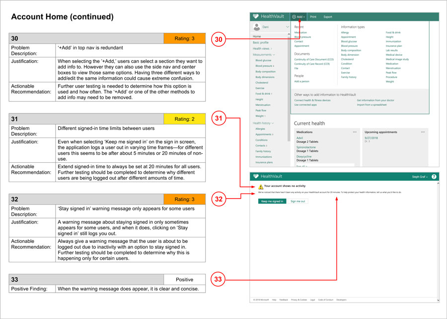
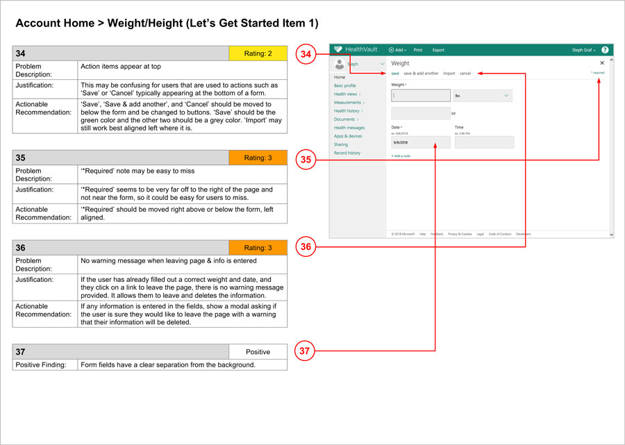
All findings and recommendations were presented in the format shown below.
Categories
Submit a Comment